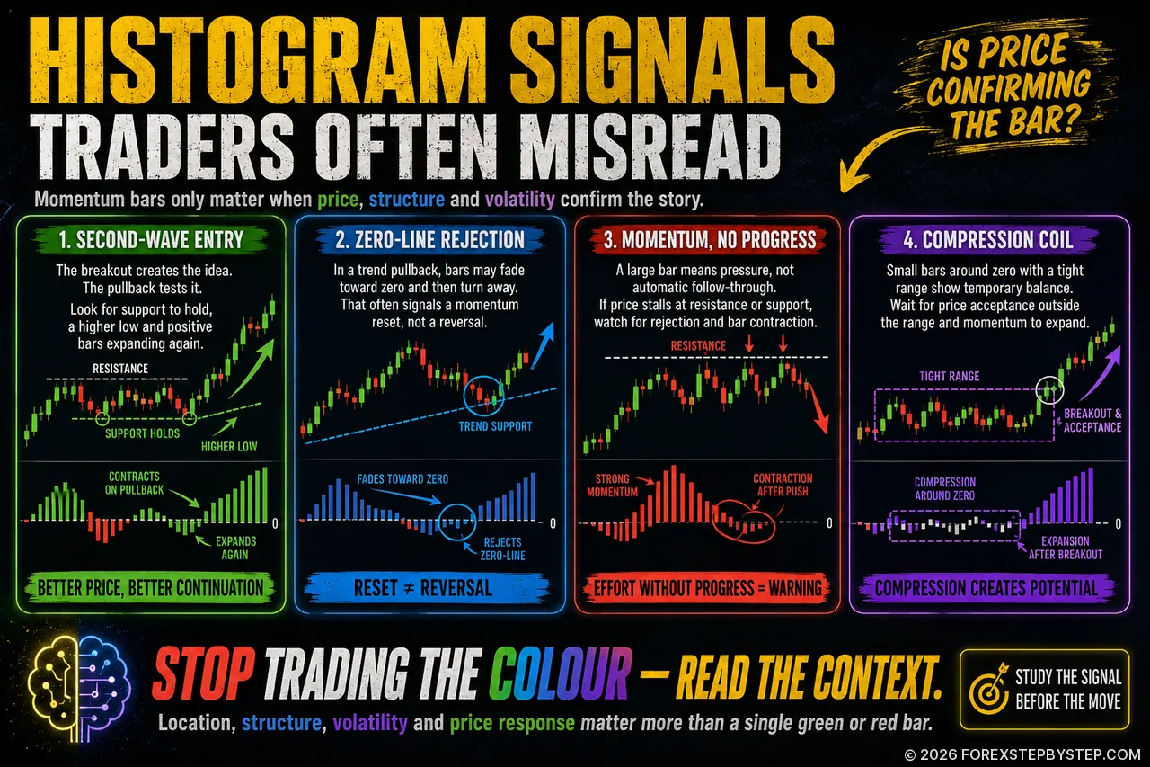
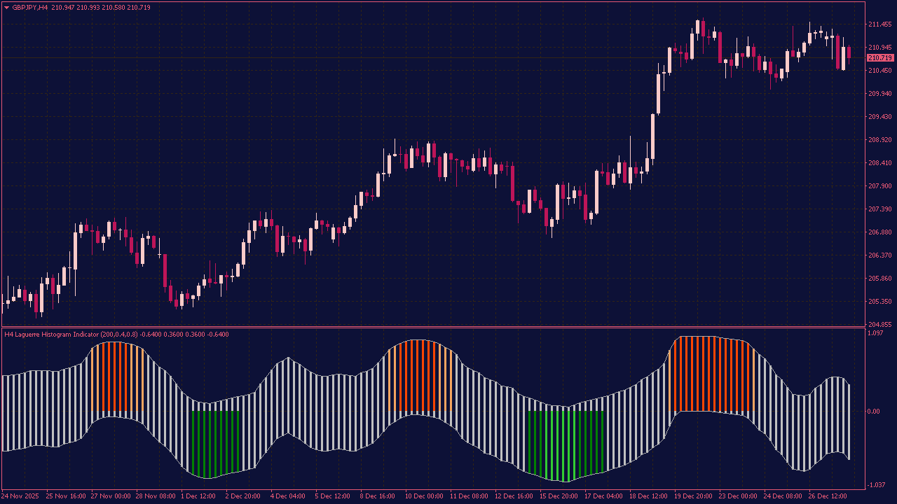
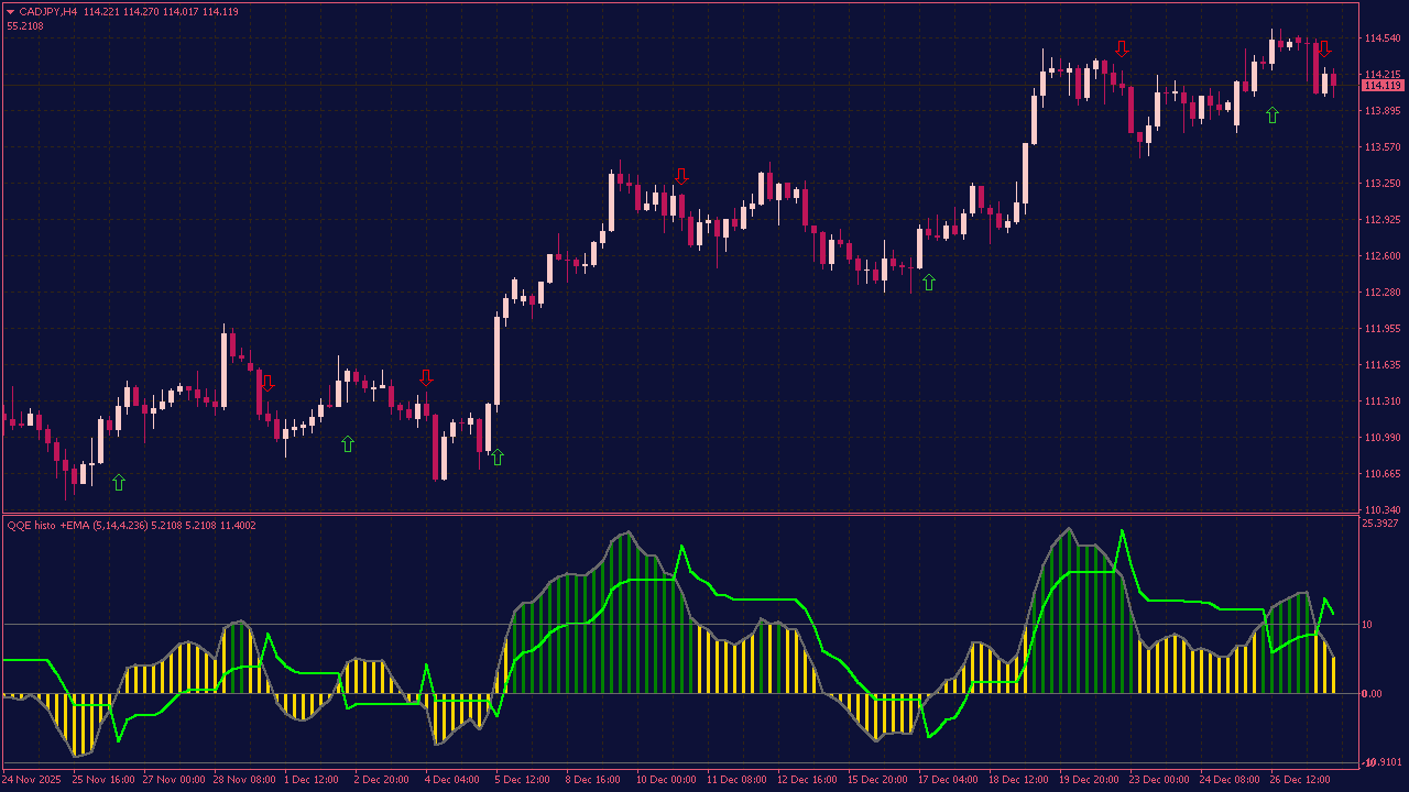
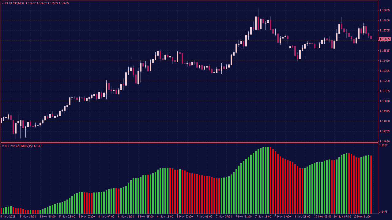
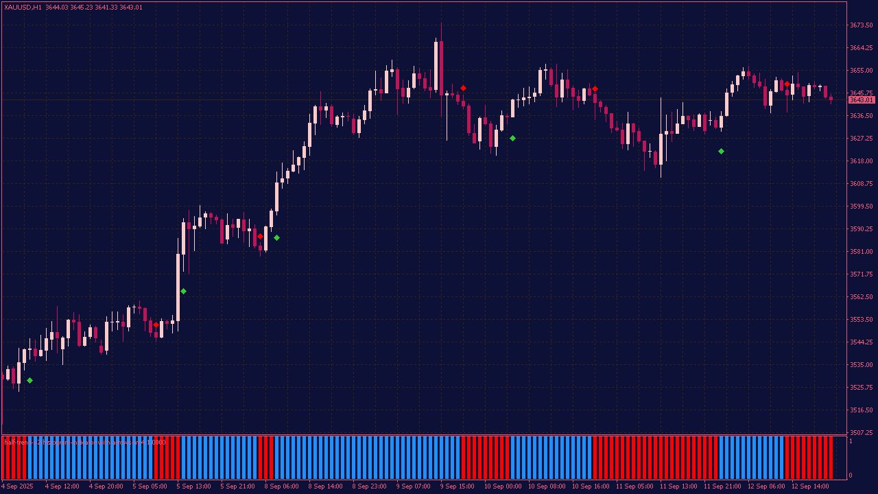
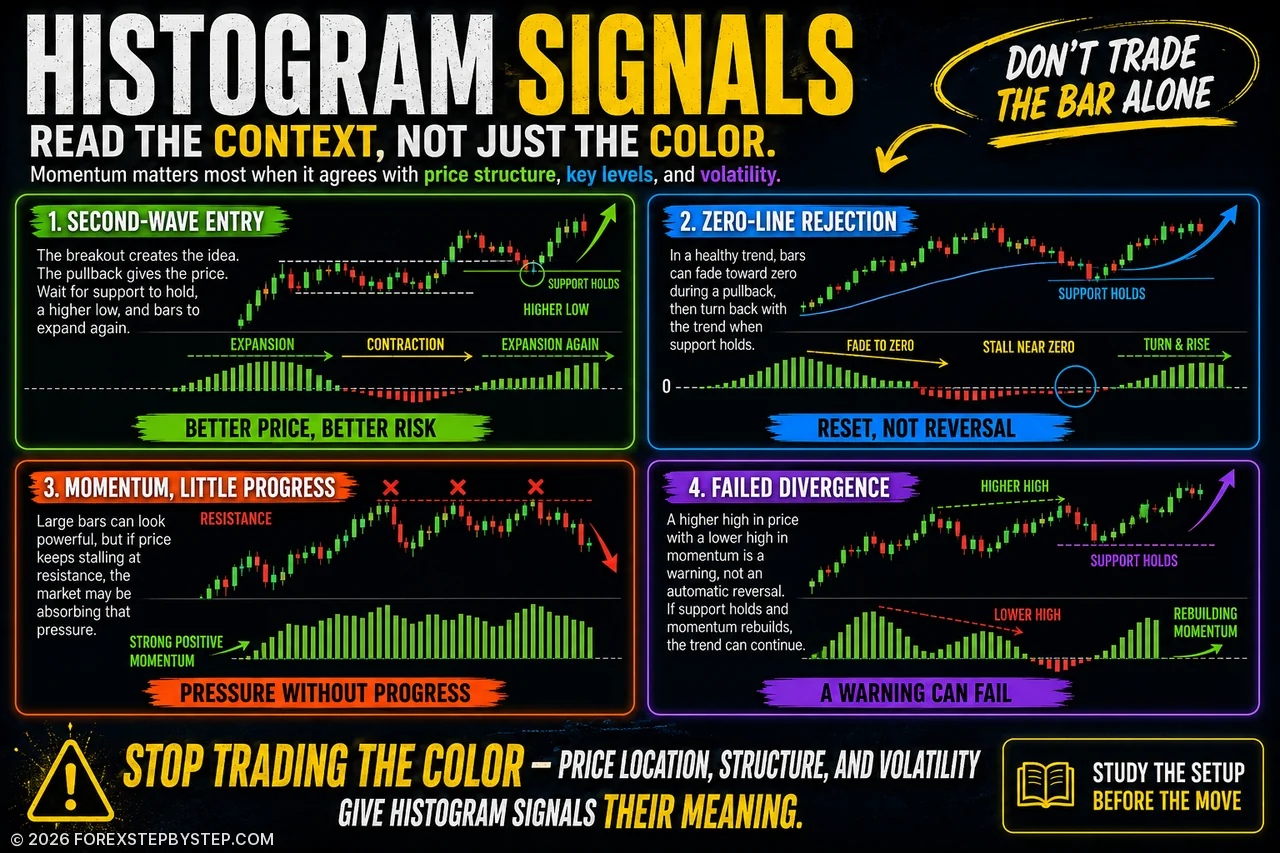
A strong histogram bar can still be misleading—these four setups reveal why price context matters more than color.
📊 What Your Histogram Isn’t Telling You
Histogram indicators are easy to read—at least until price stops behaving the way the bars suggest.
A strong MACD reading can appear just as a move begins to stall. A clean divergence may lead nowhere. And a quiet breakout, barely noticeable at first, can develop into the most important move of the session.
This article takes a closer look at 10 histogram patterns that traders often misinterpret on MetaTrader charts. It covers second-wave entries, zero-line rejections, failed divergences, momentum slowdowns, and reversals after apparent breakouts.
The point is not to search for a perfect indicator setting. It is to understand how momentum changes when price reaches an important level, loses support, or refuses to follow through.
Sometimes the clearest-looking signal is the least useful one. The bars matter—but what price does next matters more.
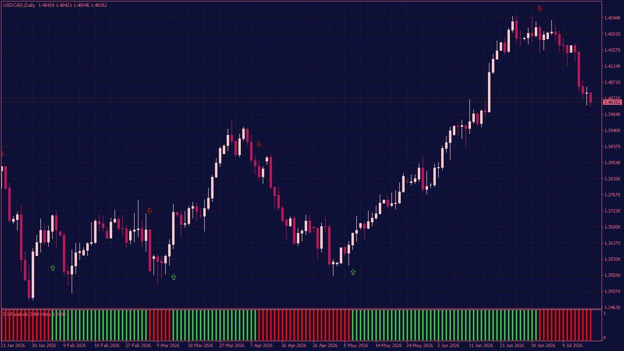
The Parabolic SAR MTF Histogram with Alerts and Arrows is made for traders who want to understand the broader direction without constantly switching between charts. It displays the Parabolic SAR trend from a selected timeframe as a simple green or red histogram. At first glance, it looks straightforward. Green shows an upward phase, red shows a downward phase. But the moment the histogram changes color is where things become interesting, especially when price is approaching an important level or the current trend already looks tired. Arrows can highlight each change directly on the price chart, while the alert options keep you informed when you are focused on something else. Sometimes one color change means very little. Sometimes it is the first clue that the market is about to behave differently.
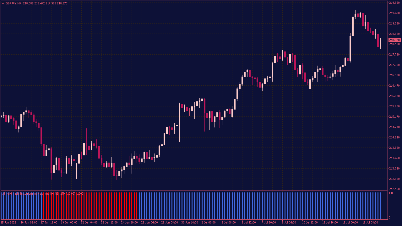
The All Heikin-Ashi Histogram Indicator gives you a cleaner way to follow market direction. It turns Heikin-Ashi price data into a simple histogram, so you can see whether buyers or sellers currently have the upper hand without adding more clutter to your chart. You can adjust the smoothing method, periods, timeframe and sensitivity to match the way you trade. This makes the indicator useful for different market conditions, whether you prefer following longer trends or watching for shorter changes in momentum. The interesting part often appears when the histogram stops confirming the current move. A new color after a long sequence may suggest that momentum is shifting, giving you a reason to take a closer look before the change becomes obvious on the price chart.
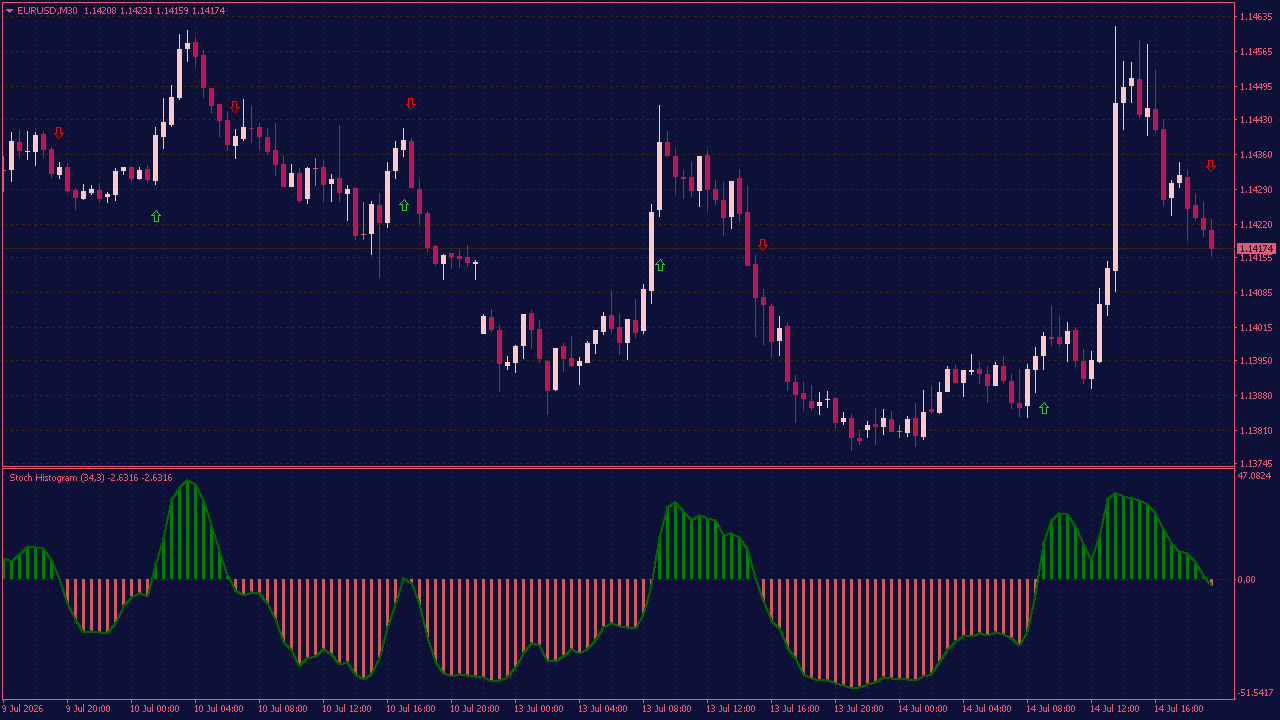
Stochastic Histogram MTF Indicator with Arrows & Alerts
The Stochastic Histogram MTF Indicator with Arrows and Alerts gives you a straightforward way to follow changes in market momentum. Instead of displaying several crossing lines, it uses a colored histogram to show whether bullish or bearish pressure is currently stronger. You can view signals from another timeframe without leaving the chart you are working on. Arrows mark potential changes in direction, while optional alerts let you know when a new signal appears. This can be useful when you want a quick confirmation without constantly watching every candle. Sometimes the first clue is not a dramatic price movement, but a small change in momentum. This indicator helps make those quieter shifts easier to notice—before they become obvious on the chart.
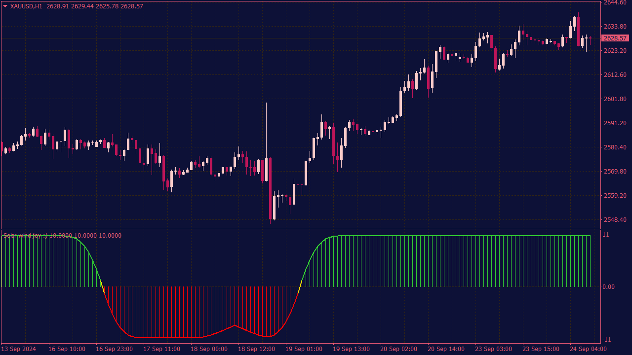
The Solar Winds Joy Histogram Indicator is designed to assist traders in identifying market momentum and potential entry or exit points. To effectively utilize this indicator, look for histogram bars changing color, which signifies shifts in momentum; green indicates bullish trends, while red suggests bearish movements. Combine this with other indicators, such as moving averages or support and resistance levels, to confirm signals and reduce false entries. Additionally, consider using the histogram's overbought or oversold levels for potential reversals, but always manage risk with appropriate stop-loss orders.
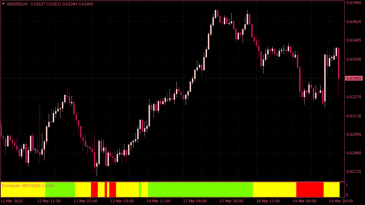
The Envelopes Histogram Indicator is a technical analysis tool that displays the distance between price and moving average envelopes as a histogram. It helps visualize market volatility, trend strength, and potential overbought or oversold conditions. The histogram bars reflect how far the price deviates from the envelope bands, offering traders quick insights into market momentum.
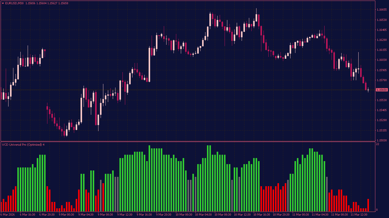
The "Vector Consensus Divergence" (VCD) indicator introduces a novel approach by comparing the slope of price movements with the slope of internal consensus, providing traders with early signals of trend fatigue or sentiment erosion. Essentially, when the price's slope diverges from the internal consensus slope, it indicates a potential weakening of the current trend, alerting traders to possible reversals or consolidation phases. This innovative concept helps traders identify subtle shifts in market sentiment before they become apparent in price action alone.
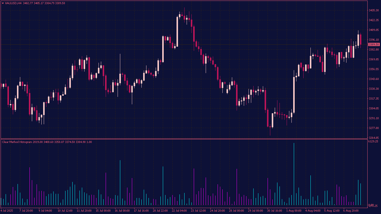
The Clear Method Histogram (CMH) is a trend-following indicator that displays a color-coded histogram based solely on price action, without using any traditional indicators or parameters. It visually represents market momentum and direction, helping traders identify bullish, bearish, or neutral trends in real-time.
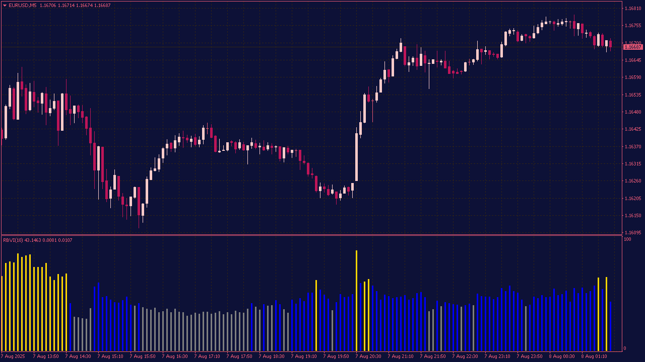
The Relative Brokers Vigor Index (RBVI) is a custom Forex indicator designed for low-volatility, night-time trading. It combines price momentum and market volatility to identify flat or active market conditions. Values below 40% indicate a flat market, ideal for range-based strategies, while values above 60% suggest high market activity, suitable for trend or breakout strategies. RBVI is commonly used in Expert Advisors (EAs) that operate during the quiet Asian session.
The Precision Trend Histogram with Lines and Alerts is a technical indicator that visualizes bullish and bearish momentum through a color-coded histogram. It features vertical lines to highlight trend changes and provides real-time alerts for potential trade entries and exits, helping traders act with accuracy and timing.
The Absolute Strength Histogram V2 Indicator measures the absolute difference between bullish and bearish momentum to reveal the strength and direction of a trend. By plotting this difference as a histogram, it helps traders quickly identify when buying or selling pressure dominates the market. A rising positive histogram suggests strong bullish momentum, while a growing negative histogram indicates increasing bearish strength, making it useful for spotting trend reversals and confirming trade signals. Version 2 includes improved visual clarity and customizable smoothing options for better trend analysis.
The Triple EMA Crossover Histogram Indicator is a technical analysis tool that combines three Exponential Moving Averages to identify trend direction and potential entry or exit points, with a histogram that visualizes the difference between the EMAs or the strength of the trend. Typically, traders use this indicator to detect bullish or bearish signals based on the crossover points of the short, medium, and long-term EMAs, while the histogram provides a quick visual cue of trend momentum and potential reversals, making it useful for aligning trades with prevailing market trends.
The Momentum ATR Normalized Histogram Indicator measures price momentum relative to market volatility by dividing momentum by the Average True Range. Displayed as a histogram, it highlights bullish or bearish strength in context, helping identify overextended moves and trend strength more accurately than raw momentum alone.
The QQE Velocity Histogram MTF Indicator is a multi-timeframe momentum indicator based on the Quantitative Qualitative Estimation algorithm. It visualizes the rate of change (velocity) of the QQE line as a color-coded histogram, helping traders identify shifts in trend strength and momentum. The MTF functionality allows users to monitor higher or lower timeframes within a single chart. Built-in alerts notify users of key velocity changes, such as histogram crossovers or momentum surges, making it ideal for scalping, swing trading, or trend-following strategies.
Precision Trend Histogram MTF Indicator with Alerts
The Precision Trend Histogram MTF Indicator with Alerts visually displays trend direction and strength across multiple timeframes using a color-coded histogram. It calculates a smoothed trend signal based on price action and optionally confirms it using higher-timeframe data. The histogram changes color based on bullish or bearish conditions, while built-in alerts notify traders of potential trend shifts or signal confirmations in real time. This tool helps enhance timing and filter noise by aligning lower and higher timeframe trends.
The Absolute Strength Histogram is a momentum indicator that measures the strength of buyers (bulls) vs. sellers (bears) and displays the difference as a color-coded histogram. It helps traders identify trend direction, momentum shifts, and potential reversals by comparing smoothed values of bullish and bearish pressure using RSI or Stochastic-style calculations.
The DMX Jurik Histogram Indicator combines the Directional Movement Index with Jurik smoothing to create a responsive, noise-reduced trend strength histogram. Unlike traditional DMI/ADX indicators, it applies the Jurik Moving Average (JMA) for ultra-smooth output with minimal lag. The histogram visually reflects bullish or bearish dominance, helping traders identify trend strength, reversals, and consolidation zones with greater precision.
The BB Stops Histogram Indicator is a trend-following tool that uses Bollinger Band–based dynamic stop levels to plot a histogram showing bullish or bearish momentum. The histogram visually indicates whether price is above or below these adaptive stops, helping traders spot trend direction shifts and manage trailing stops with improved clarity and responsiveness.
The Damiani Volatmeter Histogram with Alerts is a volatility filter indicator that uses a histogram to show whether market conditions are suitable for trend trading. It generates alerts when volatility rises above a noise threshold, signaling favorable trading conditions, and suppresses signals during low-volatility or choppy markets.
The Detrended Synthetic Price Histogram Indicator is a technical analysis tool that removes long-term trend components from a synthetic price calculation (usually derived from smoothed or averaged price data). It displays a histogram to highlight short-term price oscillations, helping traders identify overbought and oversold conditions, spot potential reversals, and fine-tune entry and exit points in sideways or corrective market phases.
The TMA Centered Histogram MTF Indicator uses a Triangular Moving Average centered on price to smooth out market noise and highlight underlying trends. Displayed as a histogram, it shows momentum shifts with color-coded bars and incorporates data from multiple time frames to provide a broader market perspective. This helps traders identify trend direction, strength, and potential reversals across different time horizons.
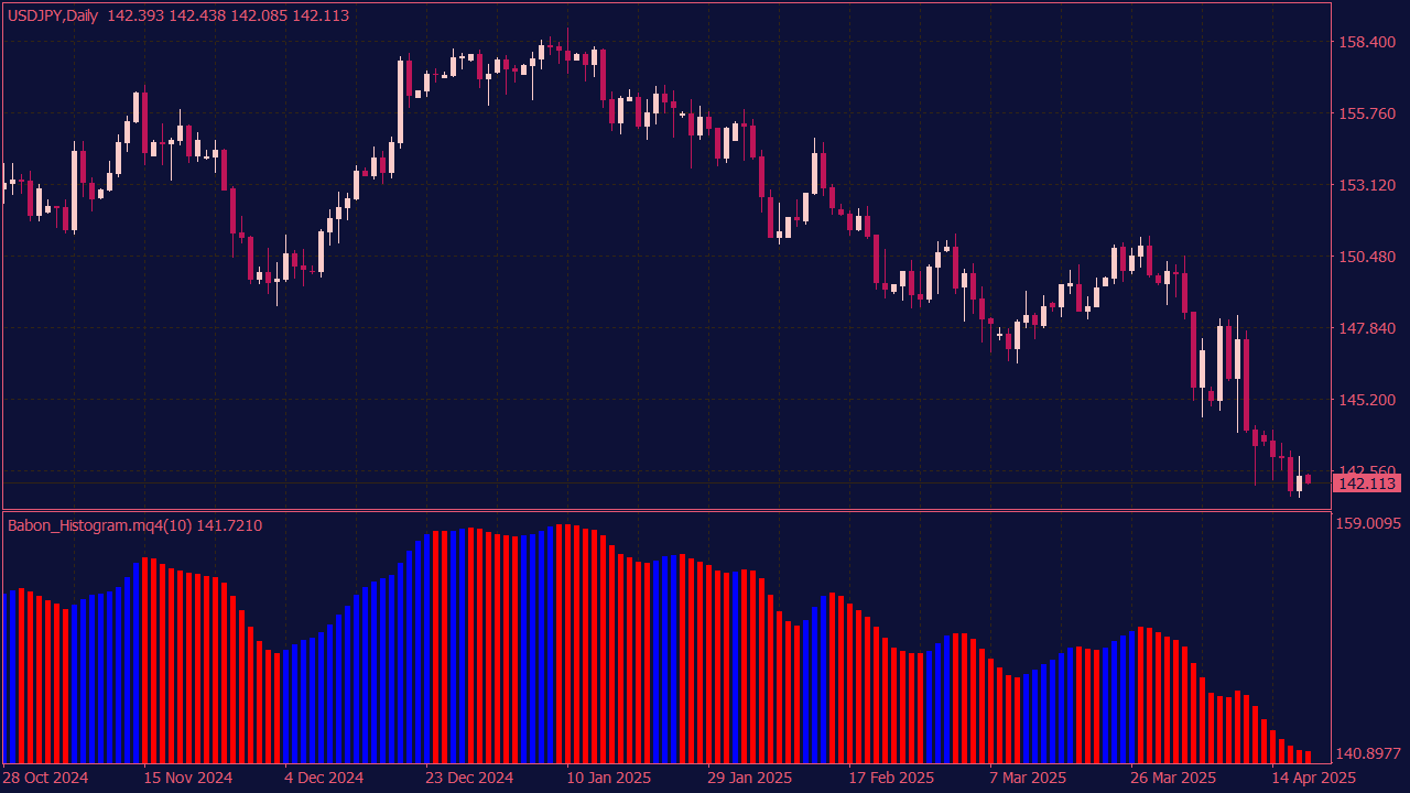
The Babon Histogram Indicator is a technical analysis tool that visualizes market momentum and trend strength through a color-coded histogram. It typically measures the difference between two moving averages or price-based values to highlight bullish or bearish pressure. The histogram helps traders identify trend direction, momentum shifts, and potential reversal points for better timing of trades.
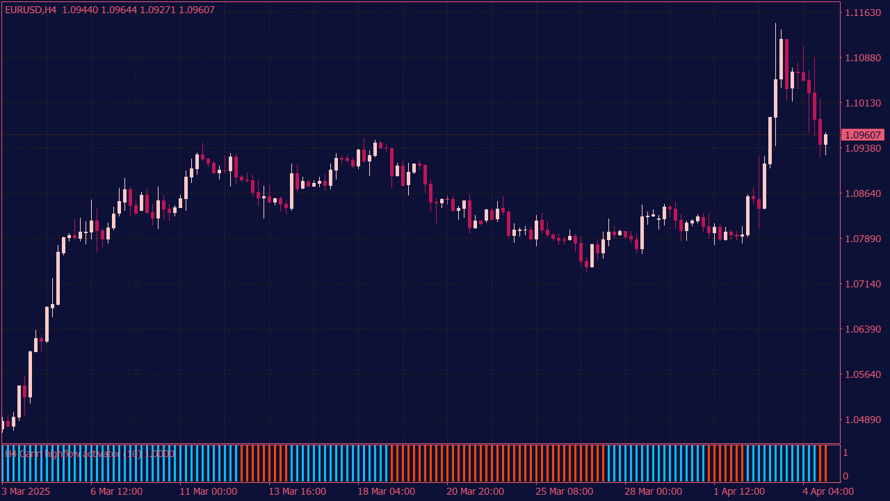
The Gann High-Low Activator Histogram is a trend-following indicator that transforms the traditional Gann High-Low Activator into a histogram format. It compares price movement to recent highs and lows to determine trend direction. The histogram bars visually indicate bullish or bearish momentum, helping traders identify trend strength, direction changes, and optimal entry or exit points.
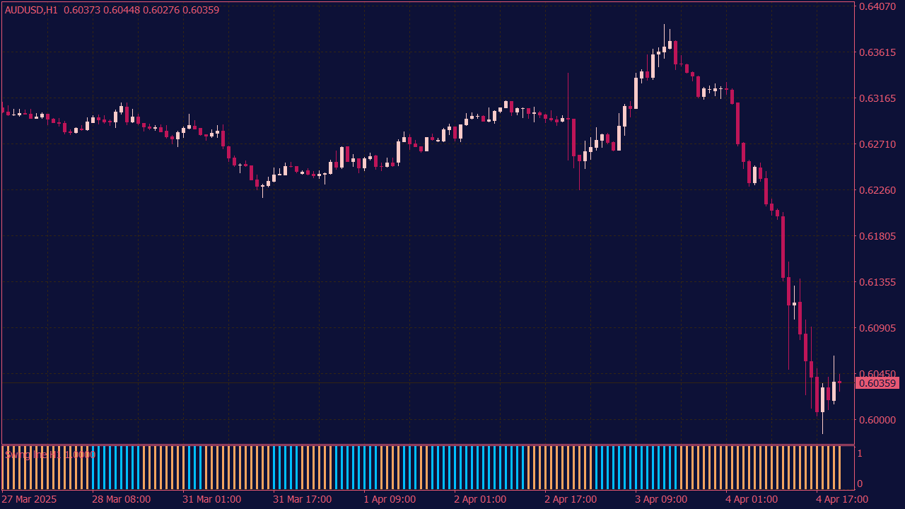
The Swing Line Histogram Indicator is a technical tool that identifies and visualizes market swing points by plotting a histogram based on price momentum or trend changes. It highlights bullish and bearish swings with color-coded bars, helping traders spot potential entry and exit points, trend reversals, and market momentum shifts more clearly.
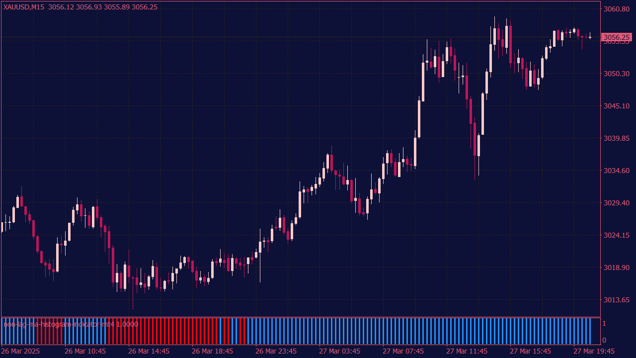
The Non-Lag Moving Average (NLMA) Histogram Indicator is a technical analysis tool designed to reduce the lag typically associated with traditional moving averages, providing traders with a more timely signal of trend changes. It visualizes the difference between the NLMA and the price or a faster-moving average, often displayed as a histogram, which helps traders identify potential buy or sell signals more quickly and accurately. This indicator is particularly useful in trending markets, as it offers clearer insights into momentum shifts, enabling traders to make more informed decisions with reduced delay.
📊 Beyond the Color Change: 10 Histogram Signals MetaTrader Traders Often Misread
Histogram indicators are easy to read at a glance. That is precisely why they are so often misunderstood. A change in color may look decisive, but the more useful signal is usually found in the relationship between momentum, price structure, volatility, and timing.
Open a typical MetaTrader chart, and you are likely to find at least one histogram below the main price window. It may be MACD, OsMA, the Awesome Oscillator, a volume display, or one of the many custom momentum indicators available for MetaTrader 4 (MT4) and MetaTrader 5 (MT5).
Their appeal is obvious. Rising bars suggest that momentum is increasing. Shrinking bars suggest that a move is losing energy. A crossover through zero appears to confirm a change in direction.
The difficulty is that the indicator does not understand the market around it.
It cannot see that price is approaching weekly resistance. It does not know that an economic release is due shortly, that trading conditions have become less liquid, or that the market has already covered most of its recent daily range.
It simply calculates a relationship between historical data points and presents the result as bars.
That information can still be valuable. It simply needs context.
Rather than asking only whether the histogram is green or red, consider three broader questions:
Is momentum genuinely accelerating, or is it merely remaining positive?
Is price responding to the apparent momentum?
Is the signal appearing at a location where the potential reward still justifies the risk?
The following patterns are not mechanical entry systems. They are practical ways of reading familiar histogram behavior with greater precision.
🌊 1. The Second-Wave Entry
The first surge in momentum is usually the one that attracts the most attention. Price breaks through resistance, the histogram expands, and the move suddenly looks obvious.
It may also be too late to offer an attractive entry.
Once the bars become visually impressive, price may already be far from the nearest logical stop. The next resistance level may be close, while the trader is forced to accept a wide invalidation point.
The second wave often deserves more attention.
Suppose EUR/USD breaks above a well-defined range, and the MACD Histogram expands sharply. Instead of buying the strongest candle, the trader waits for price to revisit the breakout area.
During the pullback, the bars contract. That is normal. What matters is whether the correction damages the original structure.
How the Setup Develops
Price breaks a clearly defined support or resistance level.
The histogram expands during the initial impulse.
Price pauses or returns toward the breakout area.
The bars contract as the pullback develops.
The former breakout level continues to hold.
Momentum begins expanding in the original direction again.
A constructive bullish continuation may develop when the former resistance area begins acting as support, price forms a higher low, and positive momentum starts rebuilding.
The indicator is not producing the trade idea. The breakout and retest create the opportunity; the histogram shows that momentum is returning at a potentially useful location.
Reasons to Reject the Setup
Price closes deeply inside the previous range.
The pullback breaks the structure of the original impulse.
Opposing momentum expands aggressively.
The second wave begins directly beneath major resistance.
The available target does not justify the stop distance.
🎯 2. The Zero-Line Rejection
Most traders watch for the histogram to cross the zero line. Fewer pay attention when it approaches zero and turns away.
During a healthy uptrend, positive bars may shrink as price corrects. Traders expecting a bearish crossover begin preparing for a reversal.
Instead, the histogram stalls near the center line and starts rising again.
The market has released some short-term pressure without establishing meaningful bearish momentum. The center line has acted as a momentum reset rather than a reversal point.
This behavior becomes more relevant when it appears near a meaningful area:
A previous breakout level
A respected moving average
A former swing high acting as support
The lower boundary of a rising channel
A higher-time-frame support zone
In the middle of a disorderly range, the same pattern may mean very little.
The bearish version works in reverse. Price retraces during a downtrend, the histogram moves back toward zero, yet bullish momentum cannot establish itself. Negative bars begin expanding again while resistance remains intact.
The important detail is not simply that the indicator turned. It is that the countertrend move failed at a location where the dominant trend could reasonably resume.
⚠️ 3. Strong Momentum, Poor Price Progress
A large histogram bar looks convincing. Sometimes it confirms a genuine breakout. At other times, it shows that the market is using considerable effort to achieve very little.
Imagine that the Awesome Oscillator prints its strongest positive reading of the session. Tick activity rises, but price repeatedly fails to close above resistance. Several candles leave upper wicks, and each advance is quickly rejected.
The indicator shows pressure. Price shows resistance to that pressure.
This may indicate absorption: aggressive buyers are active, but sufficient selling interest is preventing the market from moving higher. The bearish equivalent appears when negative momentum expands while price refuses to break support.
That does not justify an immediate countertrend trade. Strong markets can pause before continuing.
A possible reversal becomes more credible only when the failure develops further:
Price tests an important level but cannot hold beyond it.
Rejection becomes visible across more than one candle.
The histogram begins to contract.
Price returns through the breakout level.
Local structure changes in the opposite direction.
The useful observation is not that a large bar automatically signals exhaustion. It is that strong momentum would normally be expected to produce meaningful price progress.
When that progress is absent, the price response deserves closer attention.
🪤 4. The Divergence That Does Not Work
Divergence is often taught as a reversal pattern. In reality, it simply shows that price and momentum are no longer developing at the same rate.
A bearish divergence appears when price makes a higher high while the histogram forms a lower high. That may precede a reversal, but it can also lead to nothing more than a shallow pullback.
The failed version can be more interesting than the textbook signal.
Assume the broader trend remains bullish. Price forms a new high, while the MACD Histogram produces a lower peak. Sellers enter in anticipation of a reversal.
The market pulls back, but important support remains intact. No meaningful bearish structure develops. Positive momentum begins to rebuild, and price eventually breaks above the divergence high.
At that point, two groups may become active:
Trend traders entering with the breakout
Short sellers closing positions that did not work
The combination can add momentum to the continuation.
The lesson is not that divergence should be ignored. It should be treated as a warning rather than an automatic trade.
After a divergence appears, ask:
Did price break an important structural level?
Did support or resistance fail?
Was opposing momentum able to expand?
Did the original trend absorb the correction and resume?
When price refuses to confirm the divergence, the failure itself may become useful information.
🛑 5. The One-Bar Exit
A single color change is rarely a strong reason to close a profitable position.
On many histogram indicators, color only reflects whether the current value is higher or lower than the previous value. A red bar above zero can therefore represent a temporary loss of bullish momentum without indicating bearish control.
Consider an established uptrend. The Awesome Oscillator remains well above zero, but one bar turns red. The trader exits immediately. Price pauses for several candles and then continues higher.
The indicator was not wrong. Momentum had slowed. The mistake was assuming that every slowdown must become a reversal.
A more meaningful transition would usually involve several developments:
Repeated histogram contraction
Failure of price to make further progress
Formation of a lower high
A break below a relevant swing low
Expansion of momentum in the opposite direction
Even then, different strategies may respond differently. One trader may reduce the position, another may trail the stop, while a third may wait for a complete opposing signal.
The important point is consistency. Exit rules should be defined before the trade rather than invented in response to each new bar.
🤫 6. The Quiet Breakout
Not every genuine breakout begins with an explosive candle.
Sometimes price leaves a narrow range quietly. The breakout candle is controlled, the histogram remains modest, and momentum only begins to build after the market has moved beyond the old structure.
This may occur when there is little opposing liquidity. Price does not always need a dramatic burst of energy if relatively few orders stand in its way.
A quiet breakout deserves attention when price closes clearly outside the range and remains there. A successful retest can add further evidence, especially when the old boundary begins acting as support or resistance.
The opposite is also true. A quiet move that immediately returns to the range may simply reflect weak participation.
Signs of Price Acceptance
Price closes clearly beyond the range.
Subsequent candles remain outside the previous structure.
The broken boundary holds during a retest.
Histogram expansion begins to increase.
There is sufficient room before the next major level.
Waiting for the largest possible momentum bar may feel safer, but it can lead to entering after the most attractive part of the move has passed.
The decisive question is not whether the breakout looked dramatic. It is whether the market accepted prices outside the old range.
🔋 7. Exhaustion Is Not a Reversal
Contracting bars show that the current move is losing momentum. They do not reveal what comes next.
A market can slow down and then:
Continue after a brief pause
Move sideways
Form a shallow correction
Retrace more deeply
Reverse completely
The indicator identifies deceleration but cannot distinguish among those outcomes on its own.
That makes contraction particularly useful for trade management.
A trader holding a profitable position may treat weakening momentum as a reason to stop adding exposure, review the next target, or move the stop behind a recent swing. It may also support taking partial profit when price is already approaching an important level.
Opening a trade in the opposite direction requires more evidence.
A countertrend setup becomes more credible when contraction is accompanied by a failed breakout, rejection from higher-time-frame support or resistance, a change in swing structure, and expansion of momentum in the new direction.
Momentum exhaustion is often an early warning. It is not necessarily an entry signal.
🌀 8. The Compression Coil
Small histogram bars can be more useful than they appear.
When the bars cluster around zero while price narrows into a clearly defined range, the market may be moving toward temporary balance. Candle ranges shrink, volatility declines, and neither side is able to establish control.
That balance will eventually break, but the histogram does not reveal the direction in advance.
A constructive compression often includes:
Clear horizontal range boundaries
Smaller and increasingly overlapping candles
Histogram bars alternating near zero
Falling ATR or another volatility measure
An active session or scheduled event approaching
The purpose is not to predict which boundary will fail. It is to recognize that a transition from low volatility to higher volatility may be near.
A higher-quality breakout normally involves more than a quick spike. Traders may look for a candle close beyond the range, continued trading outside the structure, rising volatility, and expanding momentum.
The first move can still be a liquidity sweep, particularly when the boundaries are obvious. A retest or second close outside the range may provide stronger evidence than the initial break.
Compression creates potential. Price acceptance reveals whether that potential is becoming directional.
⚡ 9. Session Ignition
Timing changes the meaning of a signal.
A breakout during a quiet part of the day may struggle to attract follow-through. A similar move around the London open or during the London–New York overlap may encounter considerably more participation.
One common intraday pattern begins with a narrow range formed during a quieter session. The histogram remains compressed, and volatility declines. As a more active session begins, price moves toward one of the boundaries, and momentum starts to increase.
Relevant reference points may include:
The Asian-session high or low
The previous session’s extremes
The previous day’s high or low
A well-defined intraday consolidation
A major support or resistance level near the session open
The setup becomes more interesting when price closes outside the range and remains there. A brief spike is not enough. Session openings can produce false breaks as liquidity is tested on both sides.
Examine the quality of the price response:
Where did the breakout candle close?
Did the market remain outside the range?
Was the boundary successfully retested?
Did momentum persist after the initial burst?
Time of day is not a trading system. It is a filter that helps explain why similar-looking signals may behave differently.
🔄 10. The Momentum Flip After a Liquidity Sweep
Some reversal structures begin with a breakout that initially appears genuine.
Price trades above a visible swing high. Breakout traders enter, protective stops may be triggered, and the histogram expands positively.
Then the market fails to hold above the level.
The breakout candle shows rejection, price closes back beneath the high, and positive momentum begins to contract. If nearby support subsequently breaks and negative histogram bars expand, the original move may have been a liquidity sweep rather than true continuation.
A Bearish Sequence
Price moves above a widely watched high.
Momentum expands during the breakout.
The market fails to remain above the level.
Price closes back beneath it.
Positive bars begin shrinking.
The nearest bullish swing structure breaks.
Negative momentum starts to expand.
The bullish version develops below a visible low.
This pattern tends to be more relevant around levels likely to attract a concentration of orders, such as previous daily highs and lows, weekly extremes, session boundaries, and established range edges.
The histogram helps describe the transition from expansion to failure. The location explains why that transition matters.
🚦 A Better Way to Read Histogram Signals
“Buy when the bars turn green and sell when they turn red” is easy to remember. It is also incomplete.
A bullish signal can appear directly beneath weekly resistance. A bearish crossover can develop just above major support. A large momentum bar may print after price has already completed most of its recent intraday range.
The indicator can be directionally correct while the trade itself offers poor positioning.
Before acting, ask five questions:
Where is price? Is the signal appearing at a meaningful level or in the middle of an unstructured range?
What phase is momentum in? Is expansion beginning, already mature, or starting to fade?
Is price confirming the indicator? Is the market moving efficiently, or is it resisting the apparent pressure?
Who may be trapped? Are breakout traders, divergence traders, or countertrend traders positioned on the wrong side?
Where is the idea invalid? Can the trade be proven wrong at a logical level without requiring an excessive stop?
These questions will not eliminate losing trades. They can, however, filter out many entries that look attractive only because a bar has changed color.
🧩 Final Thoughts: There Is No Secret MACD Setting
The trading industry often suggests that experienced market participants possess a hidden combination of indicator settings.
They do not.
No MACD configuration identifies every turning point. No histogram predicts every failed breakout. A setting that behaves well on EUR/USD during an active session may perform differently on gold, an equity index, or a less liquid currency pair.
The practical advantage comes from interpretation and selectivity.
More experienced traders may notice relationships that a simple crossover rule ignores:
Momentum increasing while price makes little progress
A divergence that fails to change structure
A pullback that cannot establish momentum beyond zero
A second expansion from a better price location
A breakout that receives no acceptance
A compressed market approaching a more active session
A dramatic signal appearing directly below major resistance
The bars remain useful. They simply need to be read as part of a wider market story.
Price location provides the setting. Structure indicates which side is in control. Volatility shows whether conditions are expanding or contracting. The histogram adds information about the pace of momentum.
None of those elements is sufficient by itself.
📝 Editor’s Note
The strategies and market concepts discussed in our content are designed to help readers better understand market behavior. They are not trading recommendations. Financial markets are volatile, and every trader should test ideas carefully, manage risk and make independent decisions.