The cleanest level on the chart may be the most dangerous one—because the real clue is not the break, but what happens after it.
🔍 Support, Resistance, Supply & Demand: What the Chart Doesn’t Show You
Some of the worst forex trades start with the cleanest-looking levels.
A perfect support zone. A textbook breakout. A retest that seems too obvious to ignore. On the chart, everything looks logical — until price slips through the level, triggers stops, and suddenly reverses in the original direction.
This is where many traders misunderstand support and resistance. The level itself is not the full story. What matters is who is positioned around it, where liquidity is sitting, and whether the breakout is truly accepted or only used to trap late entries.
In this article, we look beyond basic technical analysis and explore liquidity sweeps, failed breakouts, supply and demand zones, session traps, and the subtle clues that often appear before the real move begins.
If you have ever been stopped out right before price turned, this is the part of the market you need to understand.
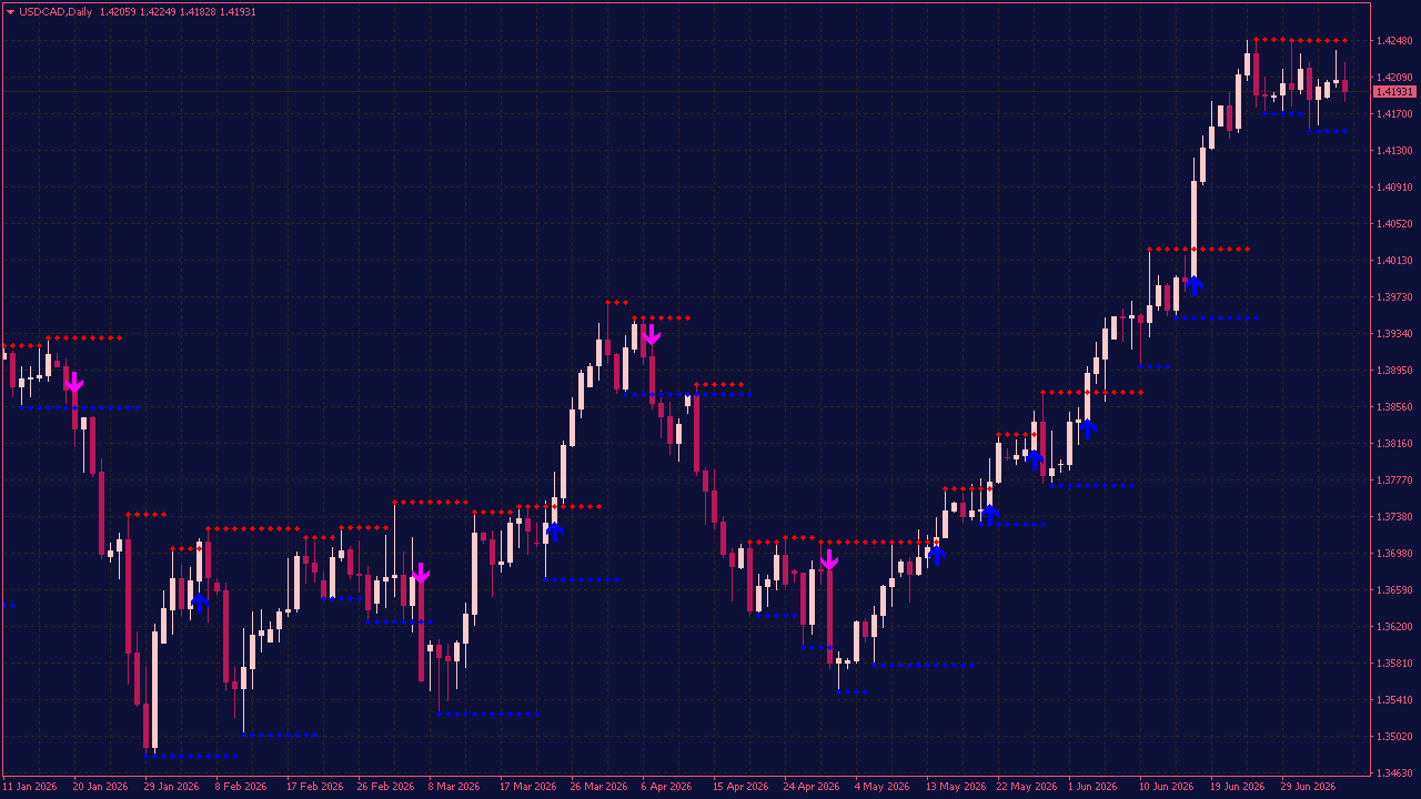
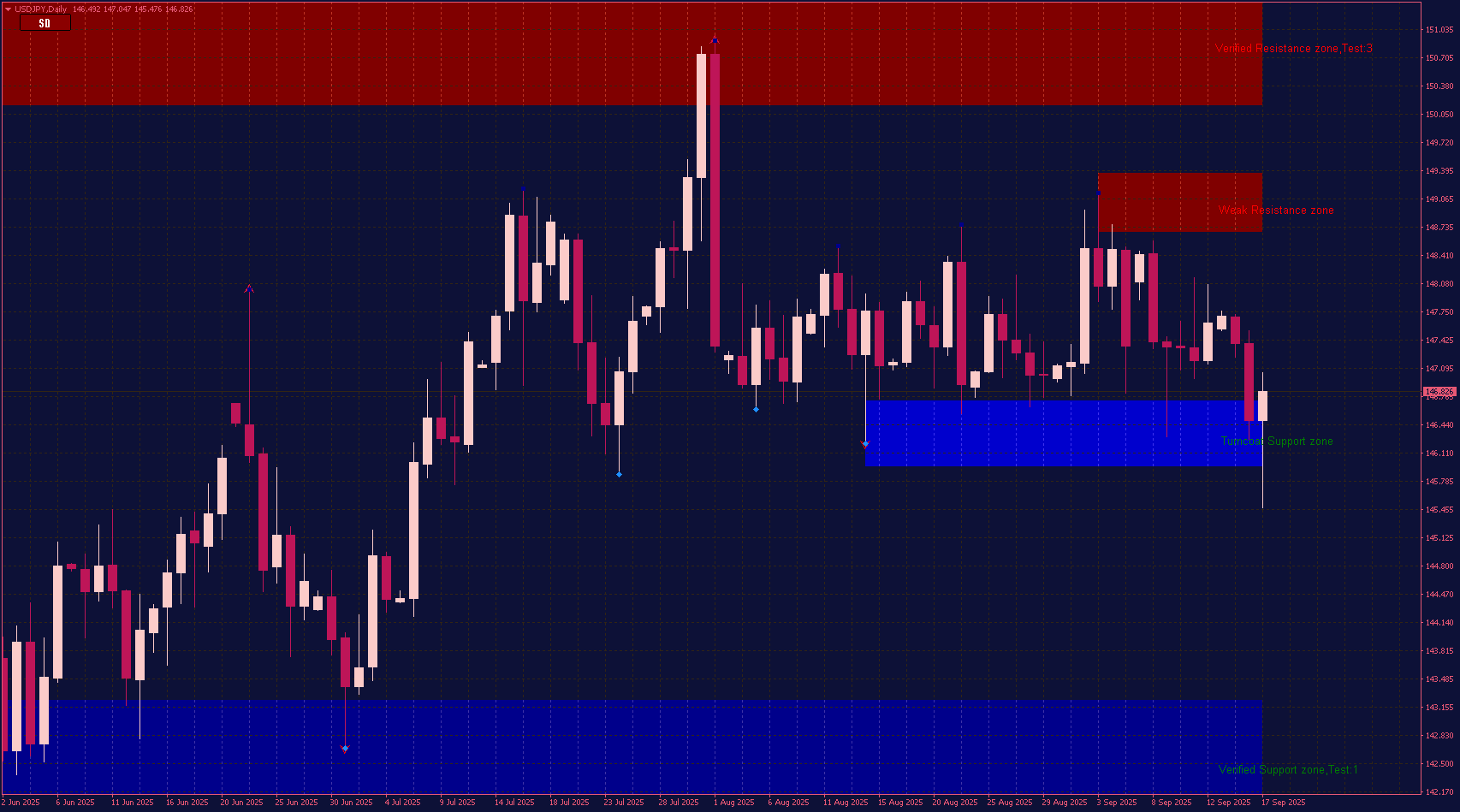
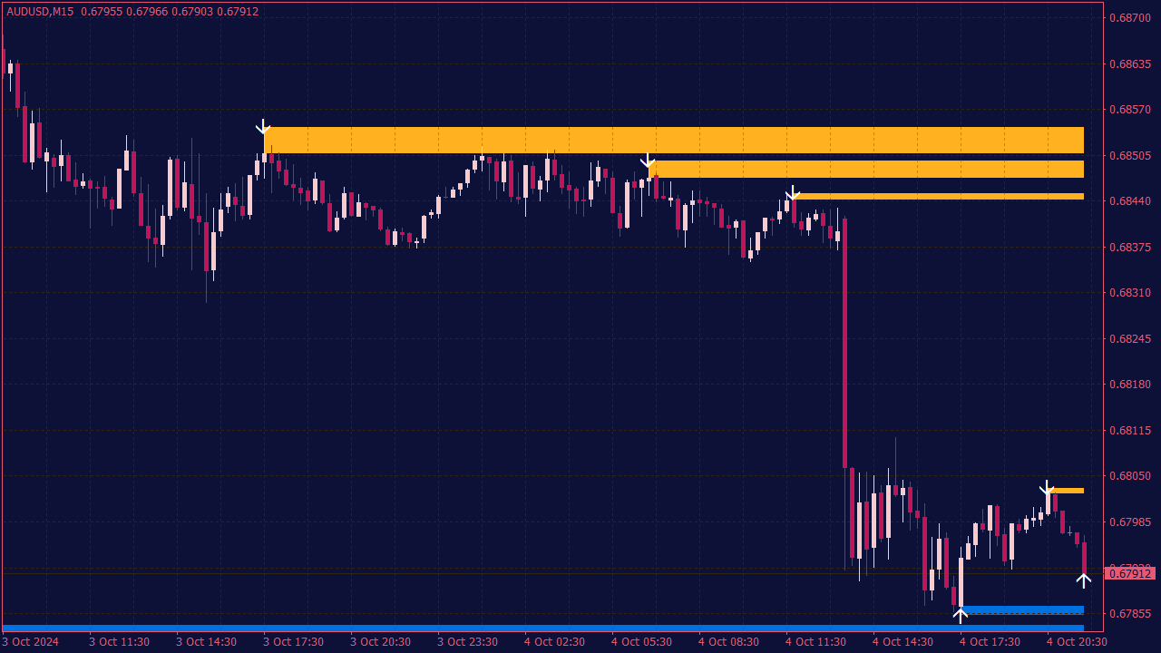
The Support and Resistance Indicator with Breakout Arrows helps you see the levels on your chart that actually matter when price starts to react. Most traders know that support and resistance can be powerful, but the difficult part is spotting the right zones at the right time. This indicator marks important price areas directly on the chart and adds breakout arrows when price moves beyond them, so you can follow the market with less noise and more structure. The real question is what happens next. Will price respect the level again, or is the breakout showing the beginning of a stronger move? This indicator gives you a clearer view of those moments, so you can watch potential opportunities before they become obvious to everyone else.
The Dynamic Support & Resistance Indicator is a practical tool for traders who want to keep an eye on the price levels that may actually matter in the current market. Instead of filling the chart with too many lines, it adapts support and resistance zones based on the active trend, which can make price action easier to follow. When the market is moving up, the indicator focuses more on support areas where buyers might step in again. When the market is moving down, it highlights resistance zones where sellers could become active. This makes it useful for traders who want a cleaner chart and a better sense of where price might react next. The interesting part is what happens when price reaches one of these zones. Will it respect the level, create a fakeout, or break through and start a stronger move? The Dynamic Support & Resistance Indicator helps you watch these moments more clearly, so you can better understand how the market is behaving around key areas.
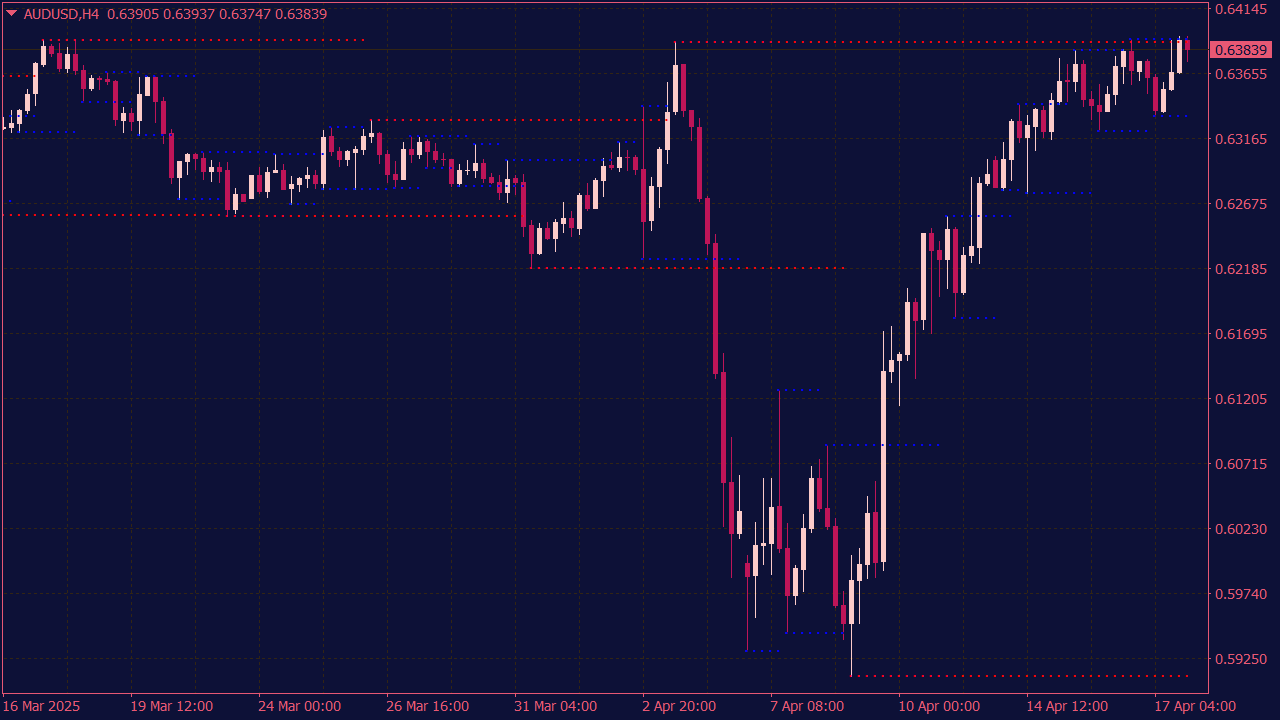
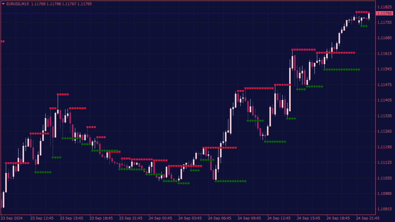
The Fractal Support Resistance Indicator is a tool that helps identify potential reversal points in price trends. To effectively trade using this indicator, look for fractal patterns that form at key support and resistance levels; this could indicate strong buying or selling pressure. Enter trades when the price breaks above a fractal high for bullish setups or below a fractal low for bearish setups, confirming with other indicators like moving averages or RSI for added validity. Additionally, consider using protective stop-loss orders just below/above fractal points to manage risk, and always monitor market conditions and news events that may impact volatility.
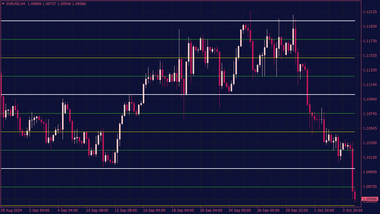
Quarters Theory Indicator is a trading tool based on the idea that price movements tend to react at specific psychological levels, typically at increments of a quarter (e.g., 0.25, 0.50, 0.75, and whole numbers). Traders using this theory look for signals such as price breaks or bounces off these levels, coupled with volume analysis or other indicators, to identify potential entry or exit points. For effective trading signals, traders might also utilize complementary indicators, like moving averages or momentum oscillators, to confirm trends and avoid false signals. It is essential to employ risk management strategies due to the inherent volatility of financial markets.
Support Resistance Zones Indicator with Trend Lines
The Support Resistance Zones with Trend Lines indicator automatically identifies key horizontal support and resistance areas along with dynamic trend lines to highlight market structure. It helps traders visualize price reaction zones and trend direction, making it easier to spot breakouts, reversals, and continuation setups. Ideal for both swing and intraday trading.
The Fractals Support & Resistance MTF with Alerts Indicator is a technical analysis tool primarily used in trading platforms to identify critical support and resistance levels based on fractal patterns across multiple time frames (MTF). This indicator analyzes price movements and highlights fractal points that signify potential reversal areas, making it easier for traders to spot opportunities. Additionally, it features alert systems that notify users when these key levels are breached or approached, allowing for timely trading decisions. This type of indicator is especially useful for traders looking to implement a multi-timeframe strategy for more accurate market predictions.
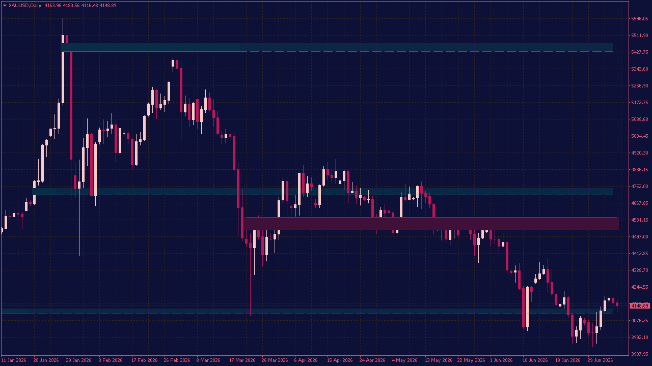
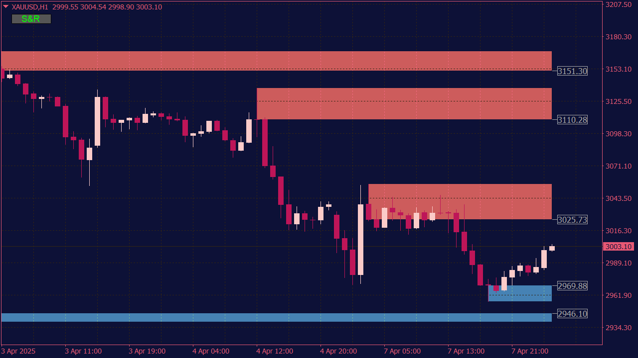
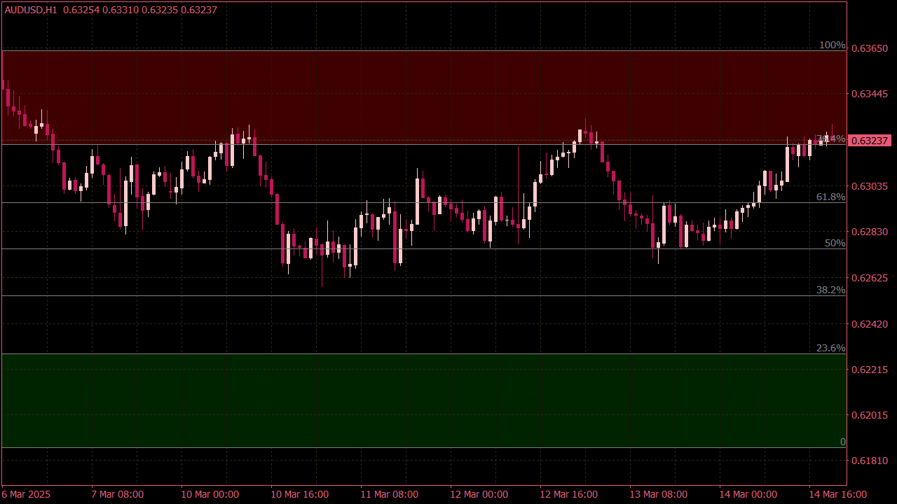
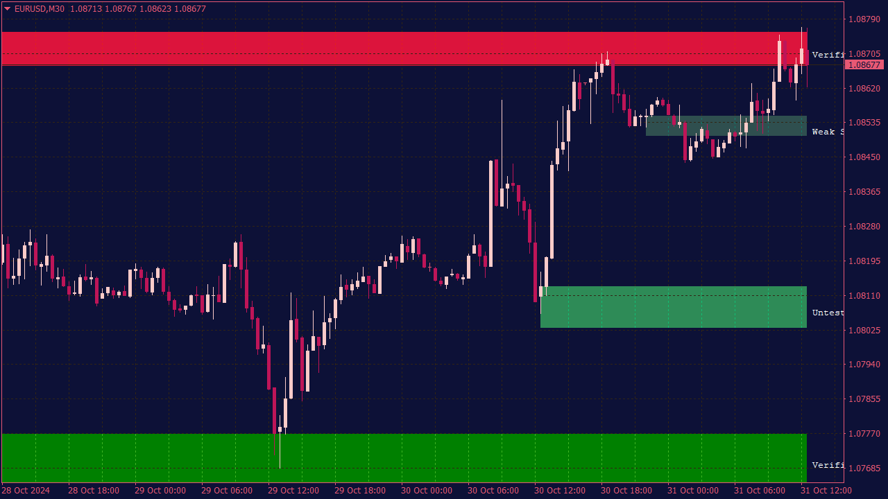
The Shved Supply and Demand Indicator is a trading tool that identifies key levels of supply and demand in the market, helping traders make informed buy and sell decisions. Generally, buy levels are identified at demand zones, where buying pressure exceeds selling pressure, leading to potential price reversals or upward movements. Conversely, sell levels are established at supply zones, where selling pressure exceeds buying pressure, indicating potential downward movements. Traders typically look for price action, volume confirmations, and other technical indicators to validate these levels before executing trades.
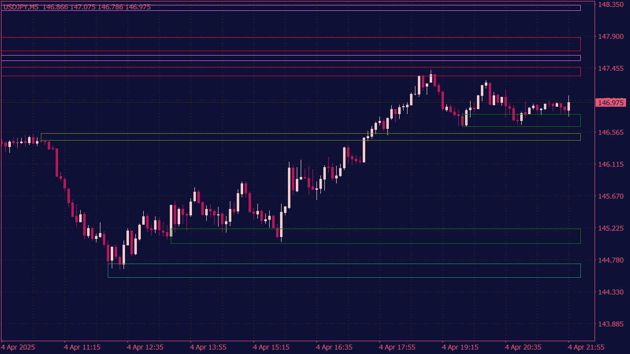
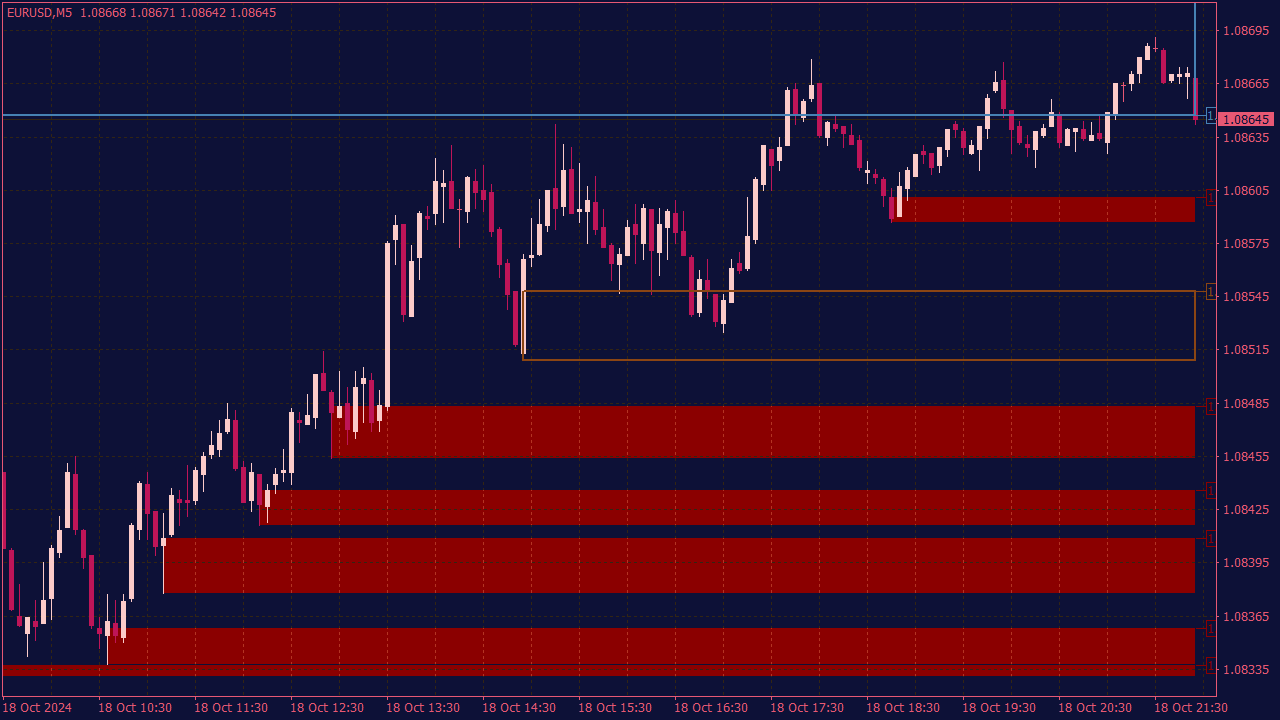
The Advanced Supply and Demand Indicator helps traders identify key price levels where supply and demand shifts occur, often indicated by zones where price tends to reverse. To trade using this indicator, first, identify significant supply and demand zones on the chart, which are areas where price has previously reversed sharply. When price approaches these zones, watch for confirmation signals such as candlestick patterns, volume spikes, or divergence with momentum indicators. Enter trades when price shows rejection from these zones, setting stop-loss orders just outside the zones to manage risk. Finally, establish profit targets based on previous support and resistance levels or expected price movement within the trend. Always ensure to practice good risk management.
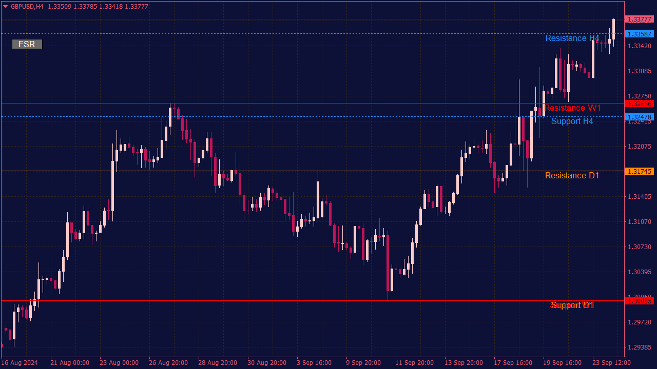
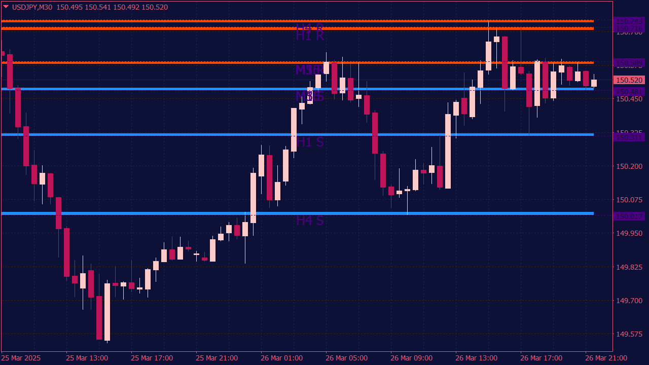
The MTF (Multi-Time Frame) Resistance & Support Indicator is a tool used by traders to identify key support and resistance levels across multiple time frames, which helps in making informed trading decisions. To trade using this indicator, first analyze the support and resistance levels displayed on the higher time frames (e.g., daily or weekly) to understand the overall trend and significant price points. Next, switch to a lower time frame (like 1-hour or 15-minute) for entry points. Look for price action signals, such as reversals or breakouts, near these levels. Enter trades in the direction of the trend when the price approaches a significant support or resistance level, ideally confirming your entry with additional indicators or volume analysis. Be sure to manage risk with appropriate stop-loss orders placed just beyond these levels.
Support Resistance Indicator with Alert and Arrows
A Support & Resistance Indicator with alerts and arrows can be a valuable tool for traders, as it visually identifies key price levels where assets are likely to encounter buying or selling pressure. This indicator not only highlights these critical points on the chart but also generates alerts when prices approach them, allowing traders to anticipate potential reversals or breakouts. Additionally, incorporating arrows to signal entry points can help traders make informed decisions, entering positions when the price either bounces off support or breaks through resistance. To effectively use this tool, ensure that it is calibrated to suit your trading time frame and the asset's volatility.
🎯 The Trap Behind the Level: How Experienced Forex Traders Read Support, Resistance and Liquidity
Every trader has seen this situation at least once.
Price moves toward a clean support level. The chart looks simple. The previous lows are clear, the reaction area is easy to mark, and the trade idea almost writes itself: buy the level, place the stop underneath, and look for the bounce.
Then price slips below support by a few pips, triggers the stop, climbs back above the same area, and rallies without you.
It feels personal. It is not.
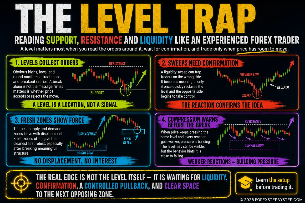
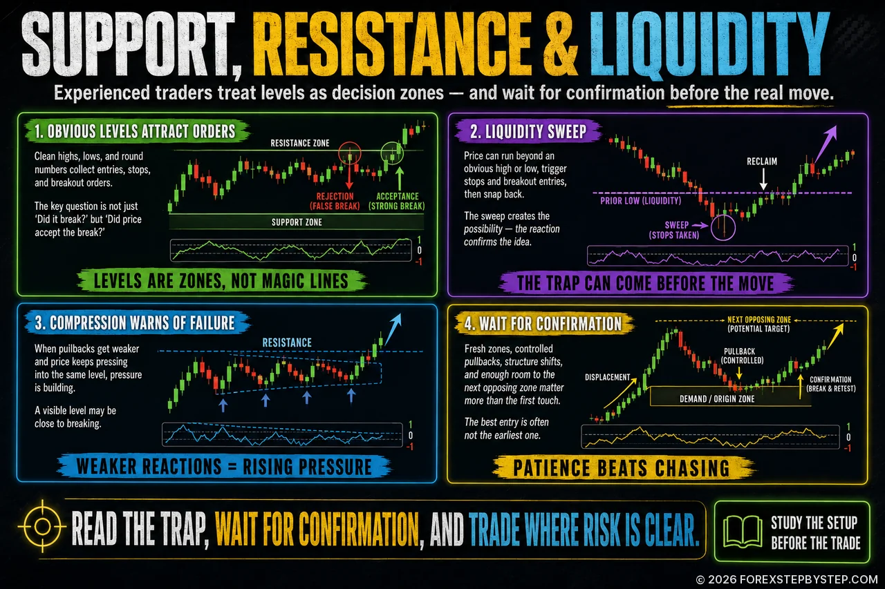
The market did not hunt one individual trader. It moved through an area where many traders had made similar decisions. That is the part most beginners underestimate. Support and resistance are not magic lines. They are decision zones. They are places where entries, exits, stop losses, breakout orders, and emotional reactions collect.
Once enough orders sit around a level, that level becomes more than a mark on the chart. It becomes liquidity.
⚠️ The Problem With Obvious Levels
The cleanest level on the chart is often the most dangerous one.
That does not mean clean structure is useless. Clear levels matter because they attract attention. A visible swing high, a clear swing low, a round number such as 1.1000, or a level that has been tested several times will naturally become a focus point for traders.
Where attention goes, orders usually follow.
Above obvious resistance, there may be buy stops from breakout traders and stop losses from short positions.
Below obvious support, there may be sell stops from breakout traders and stop losses from long positions.
When price moves into these areas, it may be collecting liquidity rather than starting a genuine breakout.
This is why a break of support does not always mean weakness, and a break of resistance does not always mean strength. Sometimes the break is real. Sometimes it is only the move before the real move.
The better question is not simply: “Did the level break?”
The better question is: “Did price accept the break?”
A wick below support that closes back above the level tells a very different story from a strong candle that breaks lower and holds there. One may show rejection. The other may show acceptance. The level is the same, but the message is not.
✋ Stop Trading the First Touch
A support zone is not a buy signal. A resistance zone is not a sell signal. A demand zone does not guarantee a rally, and a supply zone does not guarantee a selloff.
A zone is only a location. It tells the trader where to pay attention, not what to do.
The useful information appears after price arrives. Does price reject the zone? Does it hesitate? Does it sweep liquidity and return? Does it break internal structure? Does it move away with force, or does it sit inside the zone without conviction?
Many traders want to be early. They want the perfect entry at the exact top or bottom. In reality, the best entry is often not the earliest entry. It is the entry that comes after the market has shown its intention.
Being early feels clever. Being early too often is expensive.
🌊 Liquidity Sweeps: The Move Before the Move
A liquidity sweep happens when price moves beyond an obvious high or low, triggers orders, and then fails to continue. At first, the move looks like a breakout. A few candles later, it may look like a trap.
A bullish sweep often develops like this:
Price drops below a previous low.
Sellers enter the breakdown.
Long traders get stopped out.
Price closes back above the broken level.
The breakdown fails.
Buyers begin to regain control.
A bearish sweep works in reverse. Price breaks above a clear high, attracts breakout buyers, triggers stops from short positions, and then falls back below the level. If sellers follow through, late buyers are trapped.
The sweep itself is not enough. A wick below support is not automatically bullish. A wick above resistance is not automatically bearish. Wicks happen often. What matters is what follows.
Ask:
Did price reclaim the level?
Did the breakout fail quickly?
Did the market shift structure?
Did the opposite side take control?
The sweep creates the possibility. The reaction confirms whether the idea deserves attention.
⚡ Real Supply and Demand Zones Have Force
Many traders mark every small pause on the chart as supply or demand. The chart looks sophisticated, but the decision-making does not necessarily improve.
A useful supply or demand zone should show imbalance. Price should leave the area with strength. There should be a visible sense that one side of the market was overwhelmed.
A good demand zone usually begins from a tight base and leads to a strong move higher.
A good supply zone usually begins from a tight base and leads to a strong move lower.
The best zones often create displacement and break meaningful market structure.
If price leaves slowly, overlaps heavily, and struggles to move away, the zone may not deserve much attention. If price leaves aggressively, with clean candles and little hesitation, the area becomes more interesting.
A simple rule helps: no displacement, no interest.
🔁 The First Retest Is Often the Cleanest
Fresh zones deserve respect.
When price moves away from a supply or demand zone and has not yet returned, the first retest can be important. The original imbalance may not have been fully resolved, and there may still be interest around that area.
After repeated tests, the story changes. Beginners often think a level becomes stronger every time it holds. Sometimes that is true. Often, however, each test absorbs more orders. The reactions become weaker. Price keeps coming back. The level still looks important, but underneath, it may be losing power.
A level that has been attacked again and again is not always strong.
Sometimes it is tired.
Watch the quality of each reaction. If the bounces from support become smaller, buyers may be losing control. If the drops from resistance become weaker, sellers may be running out of strength.
🧱 Compression: The Warning Before the Break
Compression is one of the most useful clues on a chart because it shows pressure building.
Imagine price pushing into resistance. The first rejection is strong. The second rejection is weaker. The third pullback is barely noticeable. Price keeps pressing against the same ceiling.
At first glance, the level still looks like resistance. But the better question is: why can sellers no longer push price away?
The same logic applies to support. If every bounce from support is weaker than the last, buyers may not be defending the area with the same strength.
This is where context matters. Selling resistance blindly during compression can be dangerous. Buying support blindly during compression can be just as dangerous.
The chart may still show a level. The behavior around the level may be telling you that the level is close to failing.
🔄 Break and Retest: Good Setup, Bad Execution
The break-and-retest setup is popular because it can work beautifully. Resistance breaks, price returns, the old resistance becomes support, and the trend continues. Or support breaks, price retests from below, and the old support becomes resistance.
The problem is not the setup. The problem is how casually traders use it.
Not every break deserves a trade. A weak push beyond a level may be nothing more than noise. A breakout directly into higher-timeframe supply may have very little room to continue. A retest that falls deep back into the old range may suggest that the breakout was never truly accepted.
Before trading a break and retest, ask:
Did price break with conviction?
Did it close clearly beyond the level?
Did it break structure?
Is there enough room to the next opposing zone?
Did the retest hold, or did price fall back into the old range?
A breakout should not only cross a line. It should change the behavior of price.
📍 The Return-to-Origin Setup
One of the cleaner advanced setups is the return to origin.
Price leaves an area aggressively, breaks structure, and later returns to the origin of that move. The origin matters because that is where the imbalance began.
The setup often looks like this:
Price creates a strong move away from a supply or demand area.
The move breaks meaningful structure.
Traders chase the move late.
Price pulls back toward the origin.
The trader waits for confirmation instead of entering blindly.
The key word is controlled.
A slow pullback into the origin often creates a better setup than a violent return. If price crashes straight back into the zone, it may be challenging the original move rather than respecting it.
🕒 Session Timing: Why the Clock Matters in Forex
Forex is not only about levels. It is also about timing.
The same support zone can behave differently during the Asian session, the London open, or the New York overlap. Liquidity changes. Volatility changes. Spread conditions change. The behavior of participants changes.
One common pattern is the London trap:
Asia creates a narrow range.
London opens.
Price sweeps above the Asian high or below the Asian low.
Breakout traders enter.
Stops are triggered.
Price reverses back into the range.
The real move begins after the trap.
This should never be traded mechanically. No session pattern works every day. But when a session sweep aligns with a higher-timeframe supply or demand zone, it becomes worth watching.
The question around session opens is not: “Which direction did price move first?”
The better question is: “Was the first move genuine, or was it only a liquidity grab?”
New York can create a similar decision point. Sometimes it confirms the London move. Sometimes it reverses it, especially if London has already driven price into a major opposing zone.
Late entries after a large session move are risky. By the time the move looks obvious, much of the opportunity may already be gone.
💸 Premium and Discount: Stop Chasing Bad Prices
A simple but powerful filter is to ask whether price is trading at a premium or a discount within the current range.
In a bullish market, buying in discount is usually more attractive than buying after price has already rallied.
In a bearish market, selling in premium is usually more attractive than selling after price has already dropped.
The midpoint of the range acts as equilibrium.
This does not mean price cannot continue higher from premium or lower from discount. Strong trends can stay stretched longer than expected. But as a decision filter, premium and discount help traders avoid emotional entries.
Many poor trades come from chasing. Price rallies, the trader feels late, and buys high. Price drops, the trader fears missing the move, and sells low.
A better trader waits for price to come back to a location where risk can be defined properly.
Good trading often feels boring before it feels profitable.
🎯 The Opposing Zone Comes Before the Entry
An entry means very little without a target.
Before taking a long trade, identify the nearest meaningful supply zone, resistance level, or buy-side liquidity area. Before taking a short trade, identify the nearest meaningful demand zone, support level, or sell-side liquidity area.
If the opposing zone is too close, the trade may not be worth taking.
This is where many traders make a costly mistake. They find a beautiful entry pattern but ignore the fact that price has no room to move. The idea may be technically correct, but the reward potential is poor.
A good trade needs space.
If you are buying directly below major supply, you are not early. You may be buying into the place where other traders are preparing to exit. If you are selling directly above major demand, you may be shorting into the area where profit-taking and buying interest could appear.
The target decides whether the entry is worth anything.
🕯️ The Best Candle Is Often Not the Entry Candle
Big candles attract emotion.
A large bullish candle makes traders want to buy. A large bearish candle makes traders want to sell. The problem is that big candles often appear after the best entry has already passed.
They may show strength, but they can also mark exhaustion. Traders who enter late into the candle may be providing liquidity to those who entered earlier.
A more patient approach is to let the market show displacement, then wait for a pullback. If the move is real, price often offers a second opportunity. Not always, but often enough to make patience valuable.
Momentum is useful. Chasing is not.
⏳ Use a Time Stop, Not Only a Price Stop
Most traders understand a price stop. Fewer understand a time stop.
If price enters a demand zone and buyers are truly present, the market should react within a reasonable period. If price sits inside the zone, moves sideways, and fails to displace higher, the setup may be losing quality.
The same applies to supply. If price enters a supply zone and sellers cannot push it lower, something may be wrong with the idea.
A time stop does not always mean closing the trade immediately. It means reassessing the trade because the market is not behaving as expected.
Sometimes a trade is invalidated not by a dramatic move against you, but by the absence of the move you expected.
Silence from the market is still information.
🧩 A Cleaner Blueprint for Advanced Forex Setups
A practical trading framework does not need to be complicated. In fact, the more complicated it becomes, the easier it is to justify bad trades.
Start with the higher timeframe and identify the main market structure.
Mark only the most important supply and demand zones.
Identify obvious liquidity, such as equal highs, equal lows, and session highs or lows.
Wait for price to reach an important area.
Look for a liquidity sweep instead of chasing the first move.
Demand confirmation through rejection, displacement, or structure shift.
Wait for a controlled pullback.
Place the stop where the idea is truly invalidated.
Target the next opposing zone or liquidity pool.
Skip the trade if the reward is too small, the news risk is too high, or the setup feels forced.
This kind of process does not make trading easy. Nothing does. But it removes many of the emotional decisions that damage accounts.
🧠 The Real Edge
The real edge is not a secret indicator or a mysterious insider setup. It is understanding how predictable most traders are.
They place stops in obvious places.
They chase candles after the move is already extended.
They buy into premium and sell into discount.
They trade before major news without a plan.
They treat every support or resistance level as if it must hold.
They enter because they want action, not because the setup is complete.
The market does not need to know who you are. It only needs enough traders to behave the same way at the same level.
That is why the better question is not always: “Where should I enter?”
The better question is: “Who is trapped here?”
Once you start reading the chart that way, support and resistance look different. Supply and demand look different. Breakouts look different. Even losses become easier to understand, because you begin to see whether your idea was wrong or whether your timing was simply too early.
Forex trading will always involve uncertainty. No zone is perfect. No sweep guarantees a reversal. No setup works all the time.
But a trader who understands liquidity, waits for confirmation, respects session timing, and defines risk before entering is already operating differently from the crowd.
And in a market where the crowd is often used as fuel, that difference matters.
Editorial note
This article is for educational purposes only and does not constitute financial advice, investment advice, or a recommendation to buy or sell any currency pair. Forex trading involves substantial risk, and traders should use proper risk management and make independent decisions.