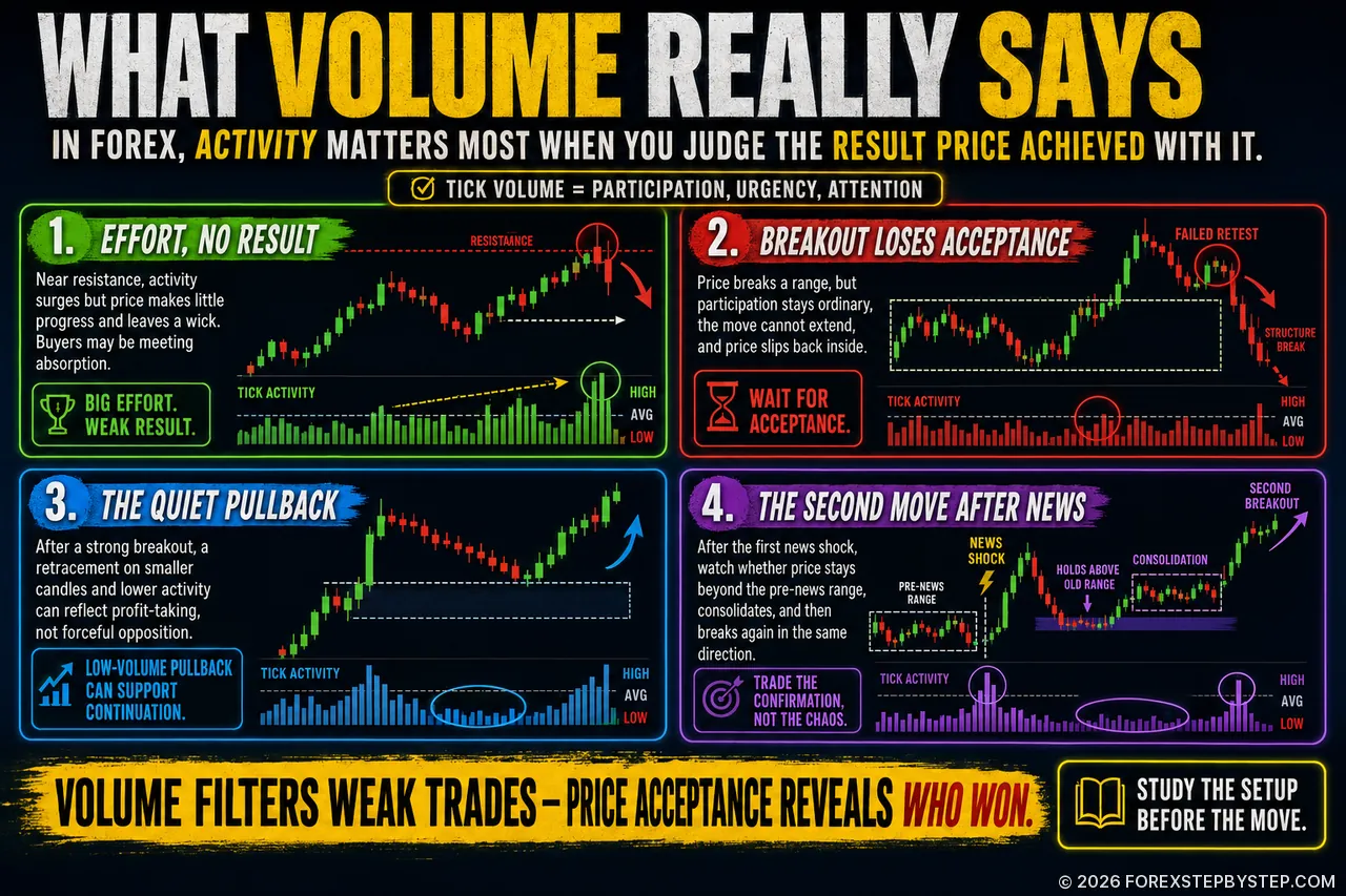
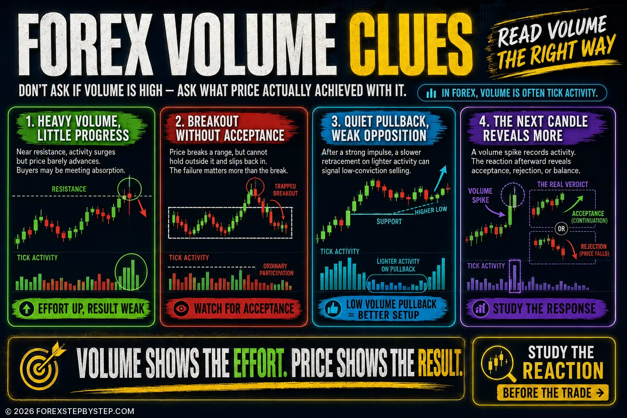
The same rise in activity can signal absorption, rejection, or continuation—the clue is what price does next.
🔎 The Volume Clues Most Forex Traders Miss
Some of the most revealing volume signals are the ones that seem contradictory at first.
Activity suddenly jumps, yet price barely moves. A clean breakout loses momentum within minutes. The London session pushes through a well-watched level, only to reverse and pull price back into the previous range.
Those situations are worth studying because volume alone rarely tells the whole story.
This article looks at eight less obvious setups, from absorption and weak breakouts to quiet pullbacks, failed auctions, post-news moves, and differences between spot Forex and currency futures.
It also explores a detail traders often overlook: the largest volume bar on the chart may not be the most useful signal. What happens immediately afterward can tell you much more about whether the market accepted the move or quietly rejected it.
Sometimes the reaction matters more than the spike itself.
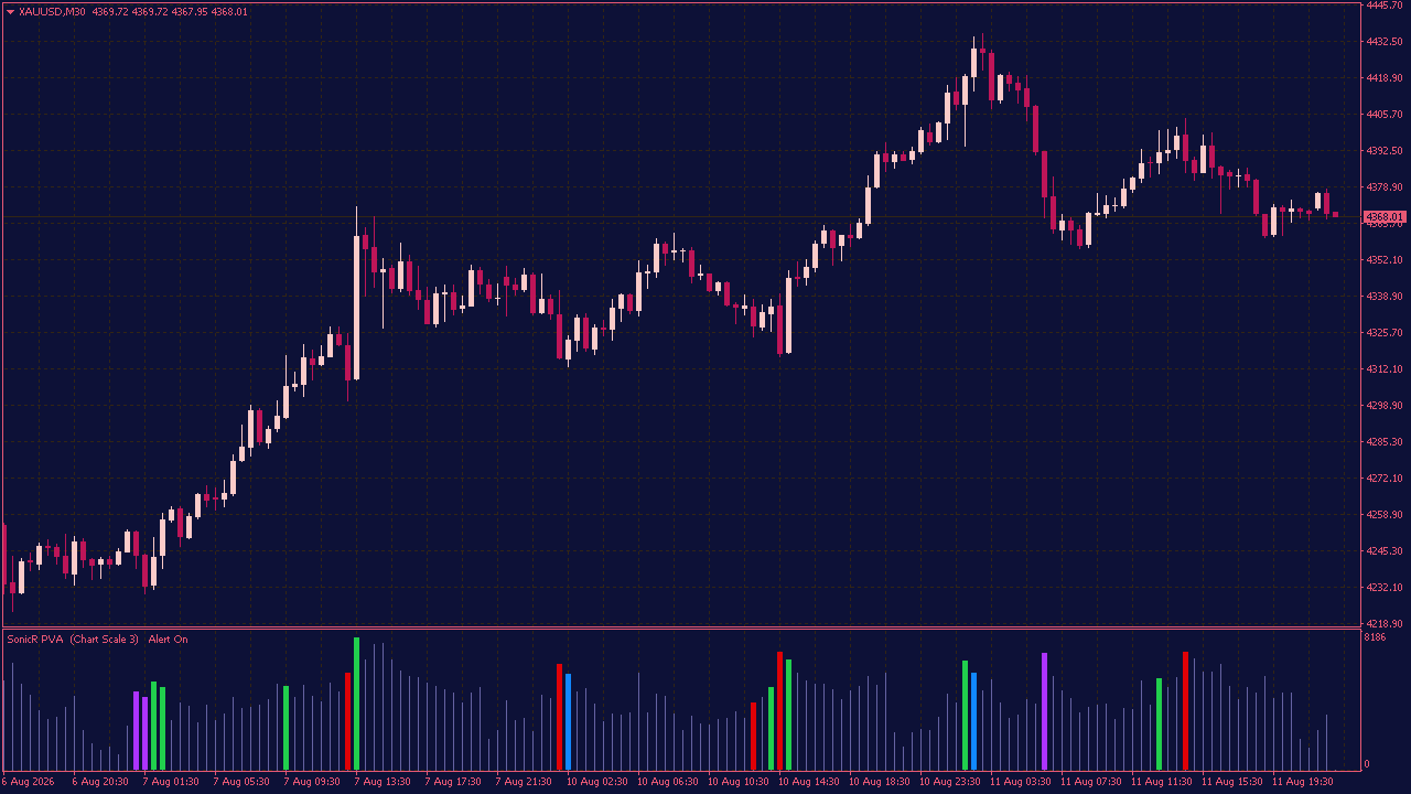
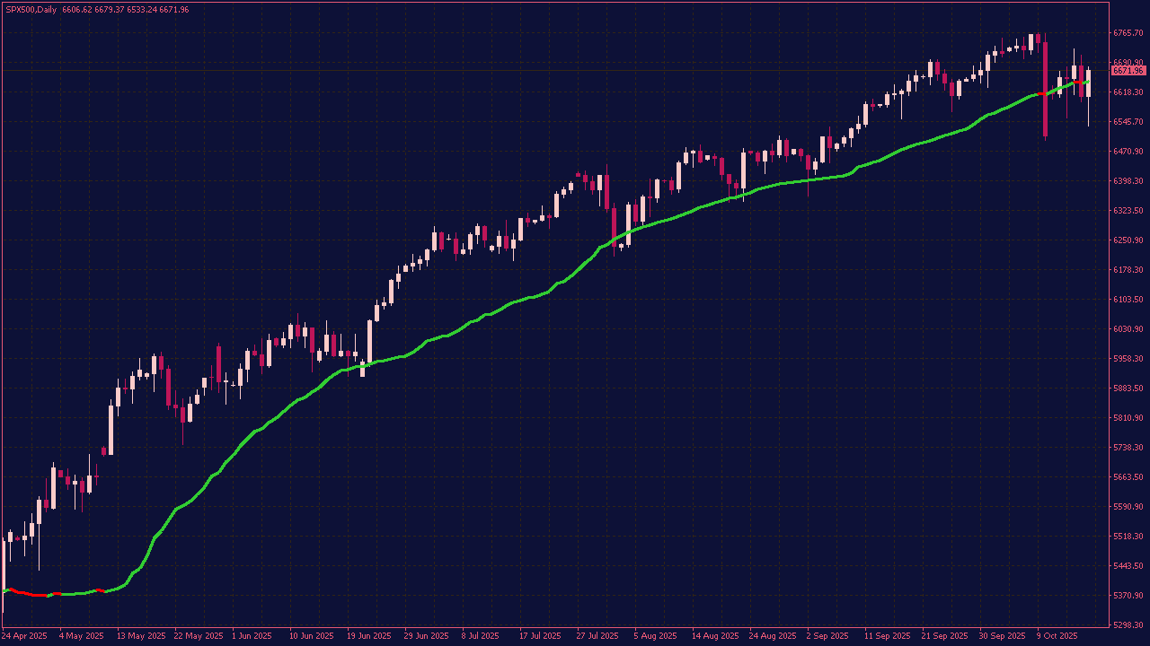
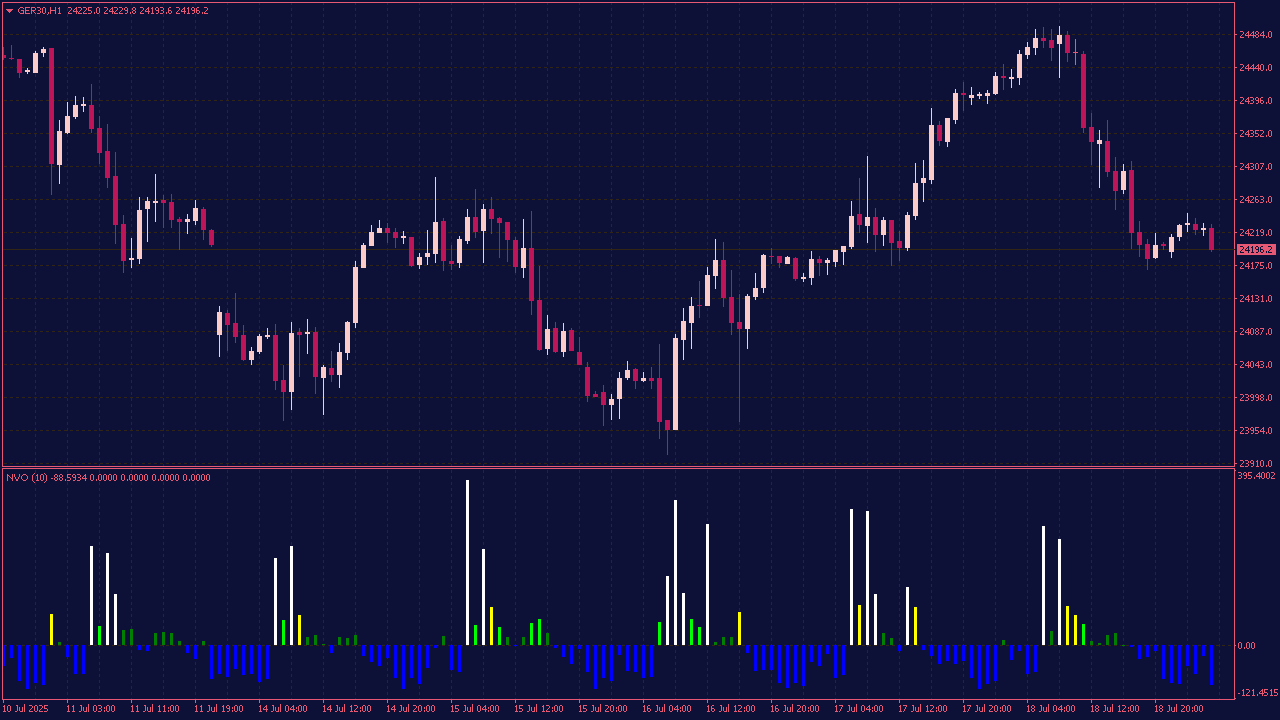
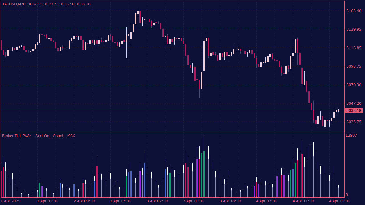
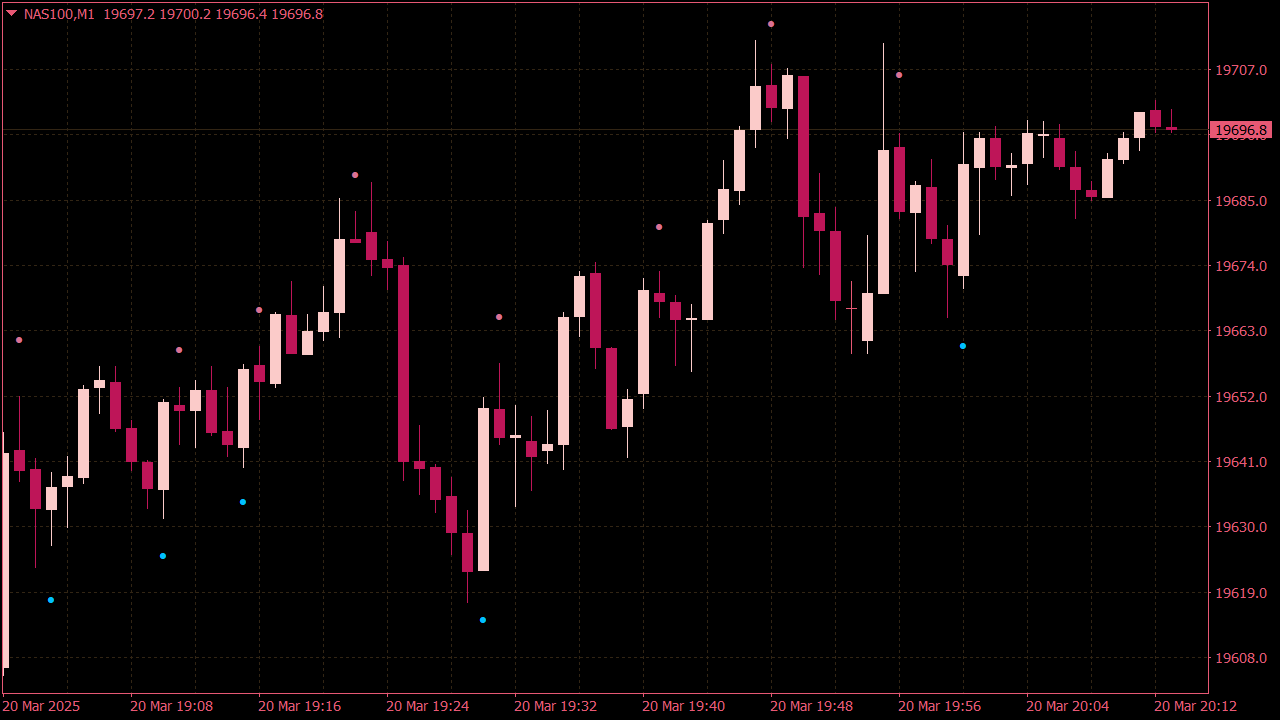
The SonicR PVA Volumes Indicator helps bring attention to those moments on the chart that are easy to overlook in real time. A sudden increase in activity, an unusually strong volume bar near a key level, or a breakout that attracts far more participation than the candles around it can all reveal that something in the market is changing. Rather than showing volume as a simple histogram, the indicator compares current activity with recent volume conditions and highlights the bars that stand out. Rising volume becomes easier to recognize, while stronger price-and-volume combinations can point to potential climax activity. This makes the indicator particularly useful around breakouts, reversals, support and resistance, and periods when momentum suddenly changes. The highlighted bar, however, is only the starting point. What price does next often matters more. Does the move continue cleanly, stall, reject the level, or reverse completely? The SonicR PVA Volumes Indicator helps make unusual activity easier to spot so traders can focus on the part that really matters: how price reacts once that activity appears.
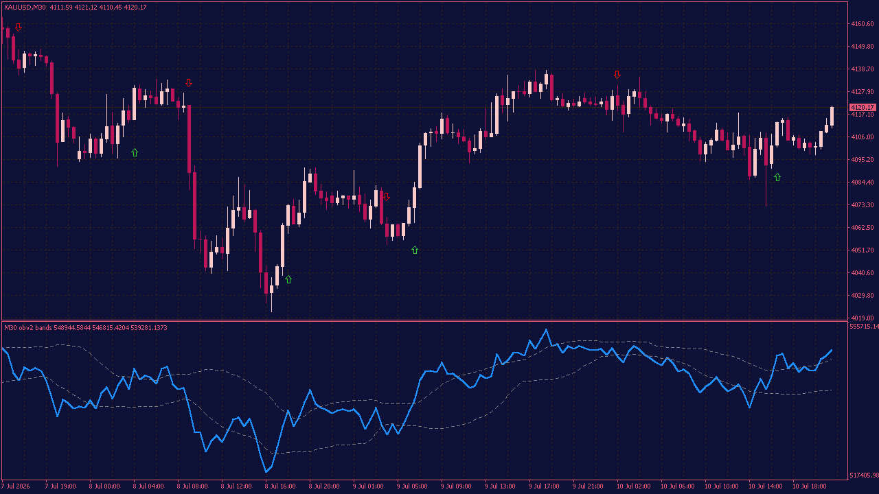
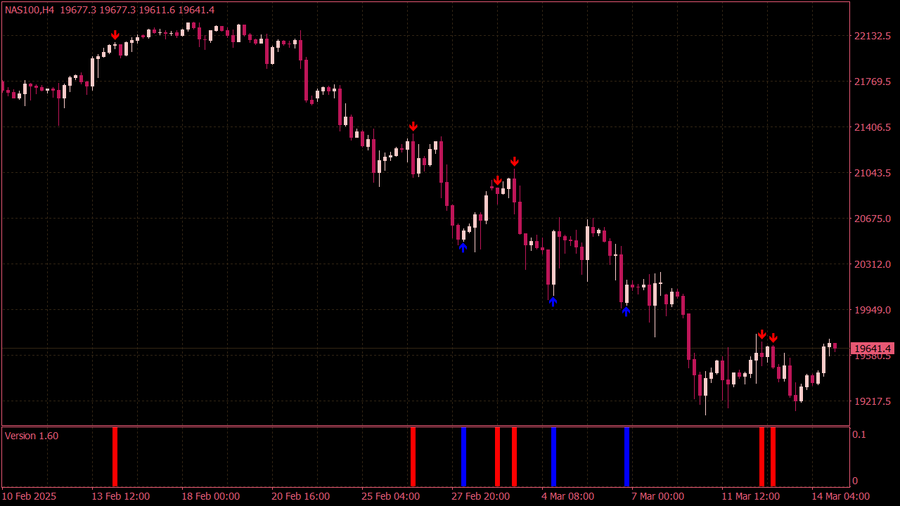
The OBV Bands Indicator with Arrows helps uncover activity that may not be obvious from the price chart at first glance. It tracks volume momentum and compares it with dynamic upper and lower bands. When the OBV moves beyond one of these levels, a directional arrow appears. This can highlight moments when buyers or sellers are becoming more active than usual, without adding unnecessary clutter to the chart. The interesting part is what happens next. Will price follow the shift in volume, or will the signal fade? The indicator does not predict the outcome, but it helps you see where something worth watching may be developing.
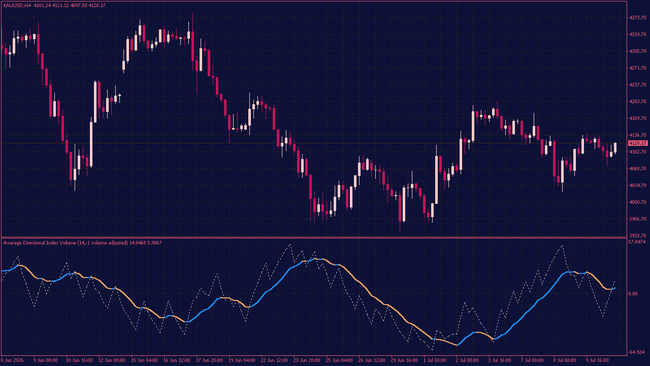
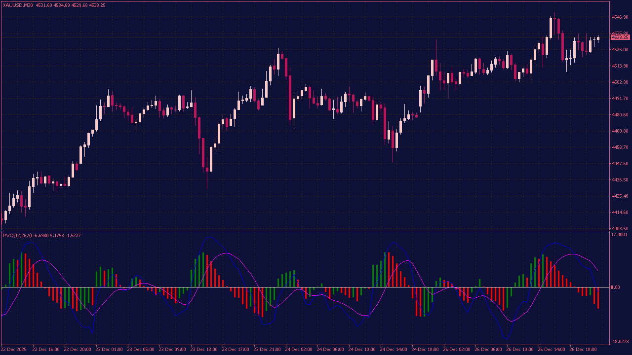
The Average Directional Index Volume Indicator helps you look beyond simple price movement. It combines trend direction with volume data, giving you a better idea of how much support a current move may actually have. You can use it to follow changes in momentum without adding unnecessary complexity to the chart. Stronger pressure, weaker movement, and possible turning points become easier to recognize at a glance. Not every move that looks strong is truly strong. The interesting part begins when price, direction, and volume stop telling different stories and suddenly start pointing the same way.
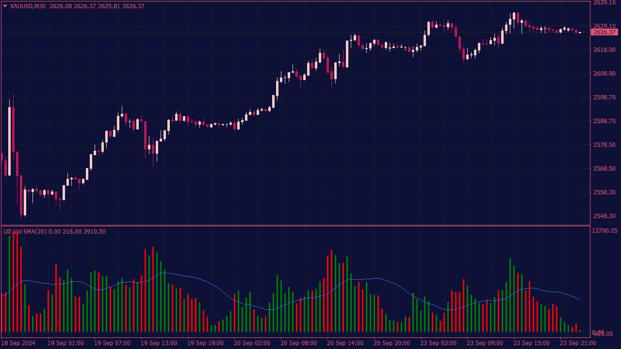
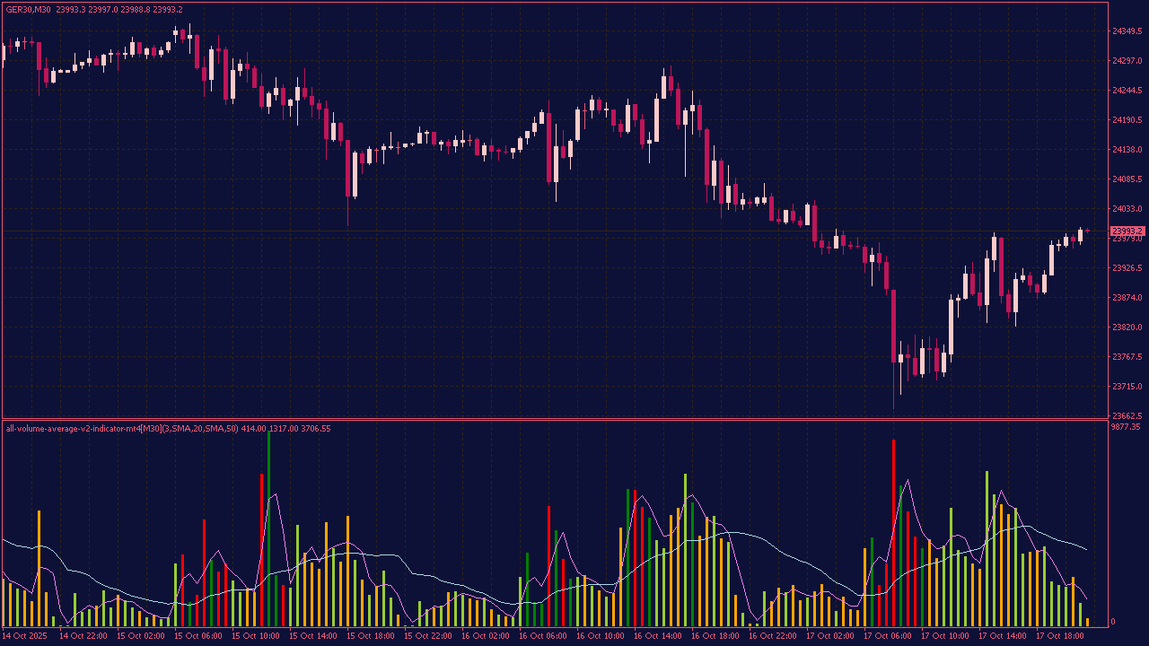
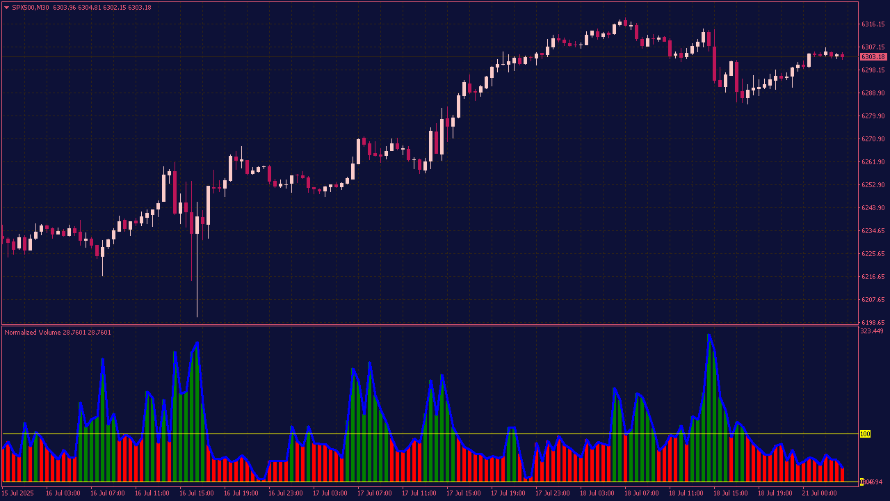
When using a custom moving average indicator in the subwindow for volume trading, consider these tips: First, ensure that your moving average is set to a suitable period that aligns with your trading strategy (e.g., short-term for day trading or longer for swing trading). Use the moving average to identify trends in volume; rising volume above the moving average can signal increasing interest or momentum in a currency, while declining volume could indicate weakening interest. Additionally, look for divergences between price action and volume moving averages to identify potential reversals or confirm breakouts. Always combine this analysis with price action and other indicators for better decision-making.
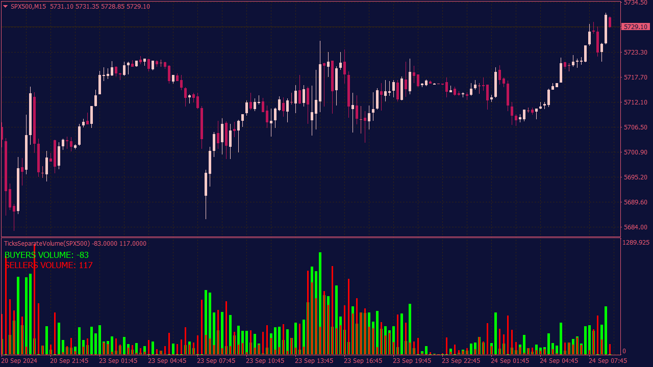
The Ticks Separate Volume Indicator is designed to analyze the volume of trades in relation to tick movements, helping traders identify market momentum and potential reversals. In a trading strategy, one might use this indicator to look for divergences between volume spikes and price movement; for example, if a price rise is accompanied by declining volume, it may signal a weakening trend. Traders can combine this indicator with other tools, such as moving averages or RSI, to confirm entry and exit points, ensuring a comprehensive approach to trading based on market behavior. Always remember to backtest any strategy under various market conditions to evaluate its effectiveness.
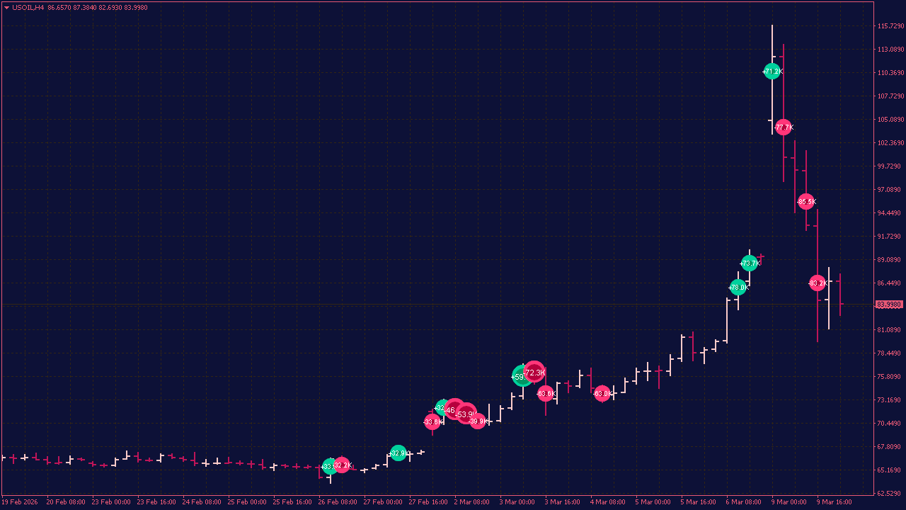
The Delta Volume Bubbles Indicator is a popular tool used by traders to visualize buying and selling pressure through volume bubbles on the chart. The trading rules typically involve interpreting these bubbles to identify potential entry and exit points: a large green bubble suggests strong buying pressure, indicating a potential long entry, while a large red bubble indicates strong selling pressure for a short position. Traders often look for clusters of bubbles or a significant change in the size and color of bubbles to confirm trend reversals or continuations. For precise rules tailored to your trading style, consider combining this indicator with other technical analysis tools like support/resistance levels or trend lines.
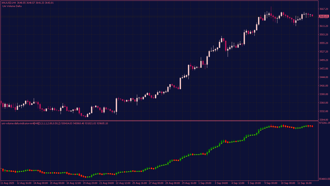
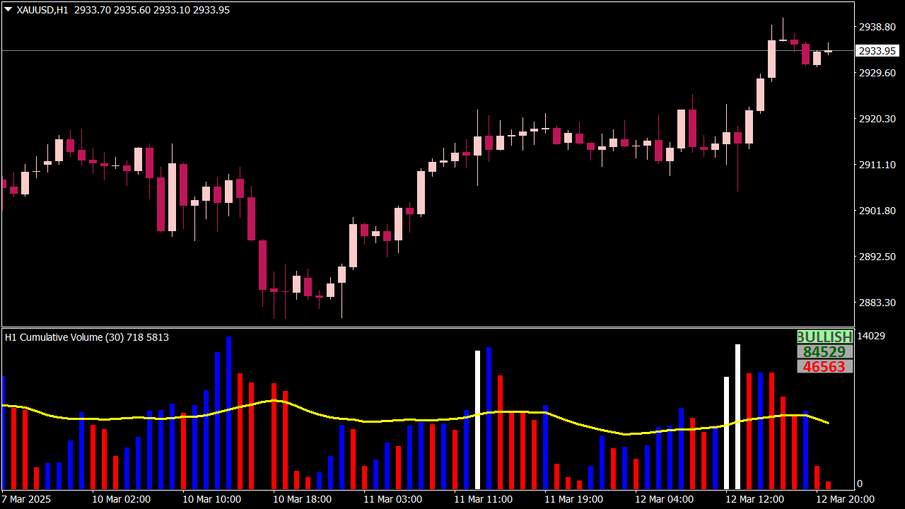
The Volume Cumulative indicator visually represents market dynamics through color-coded bars that indicate volume trends and climaxes. Blue bars signify rising up volume, indicating bullish sentiment, while red bars represent falling down volume, indicating bearish sentiment. Bull climax bars are shown in white, highlighting high intensity in buying pressure, whereas black bars denote bear climax volume, showcasing intense selling activity. By starting the cumulative volume calculation from the current day, this indicator provides a clear snapshot of market strength and potential reversal points, allowing traders to make more informed decisions.
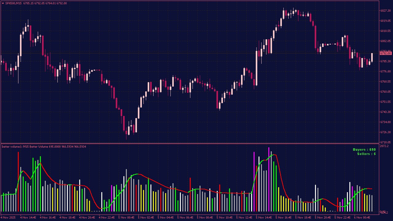
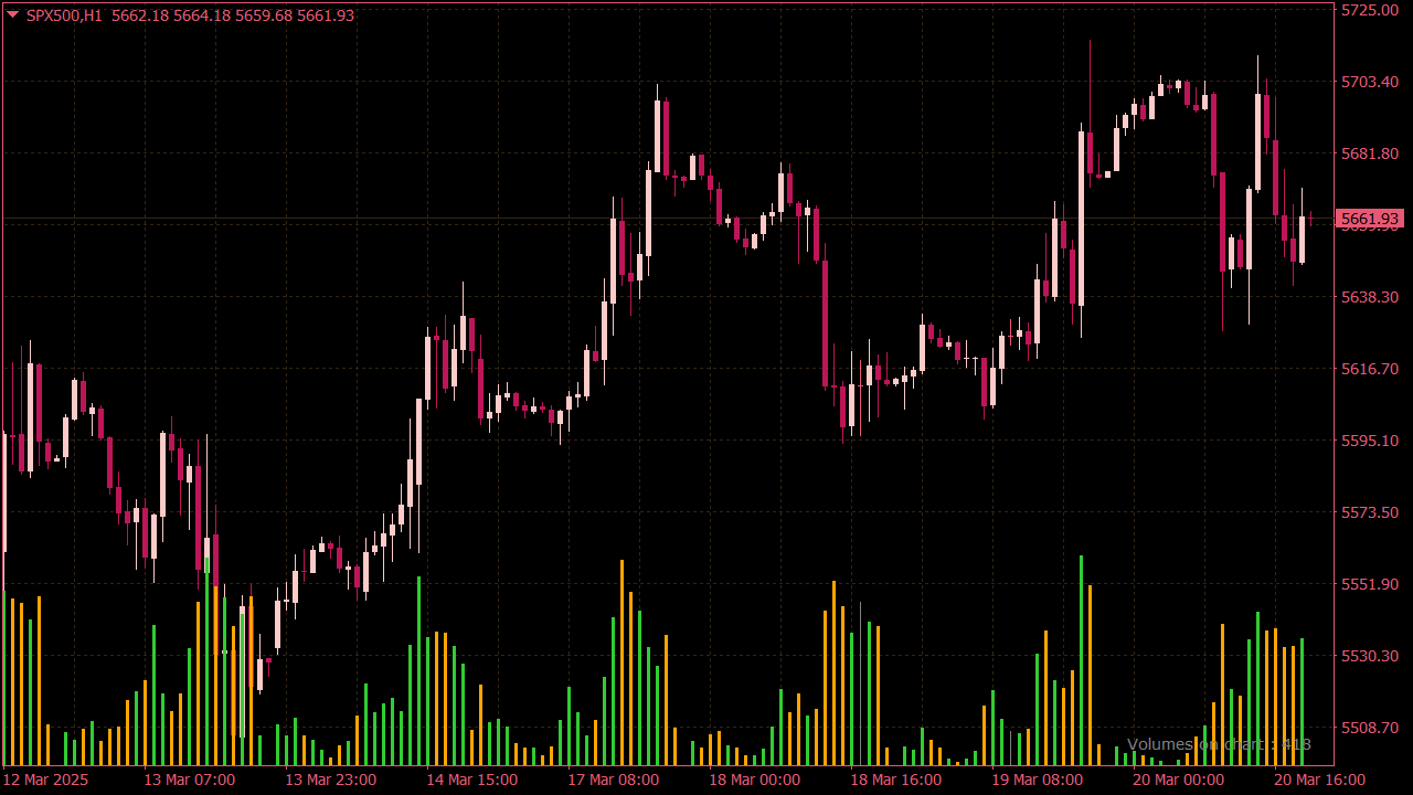
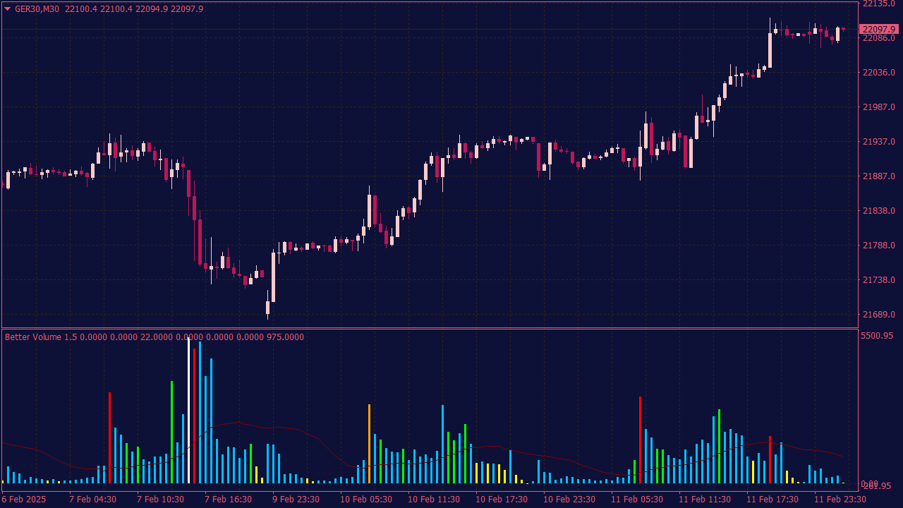
The Better Volume Indicator is a technical analysis tool designed to enhance volume analysis by helping traders identify buying and selling pressure in the market. It features color-coded volume bars that signal whether the volume is bullish or bearish, allowing traders to spot potential reversals and confirm trends. The indicator aims to improve decision-making by providing clearer insights into market dynamics, particularly in conjunction with price action. As with any trading tool, it's important to use it in collaboration with other indicators and analysis methods for optimal results.
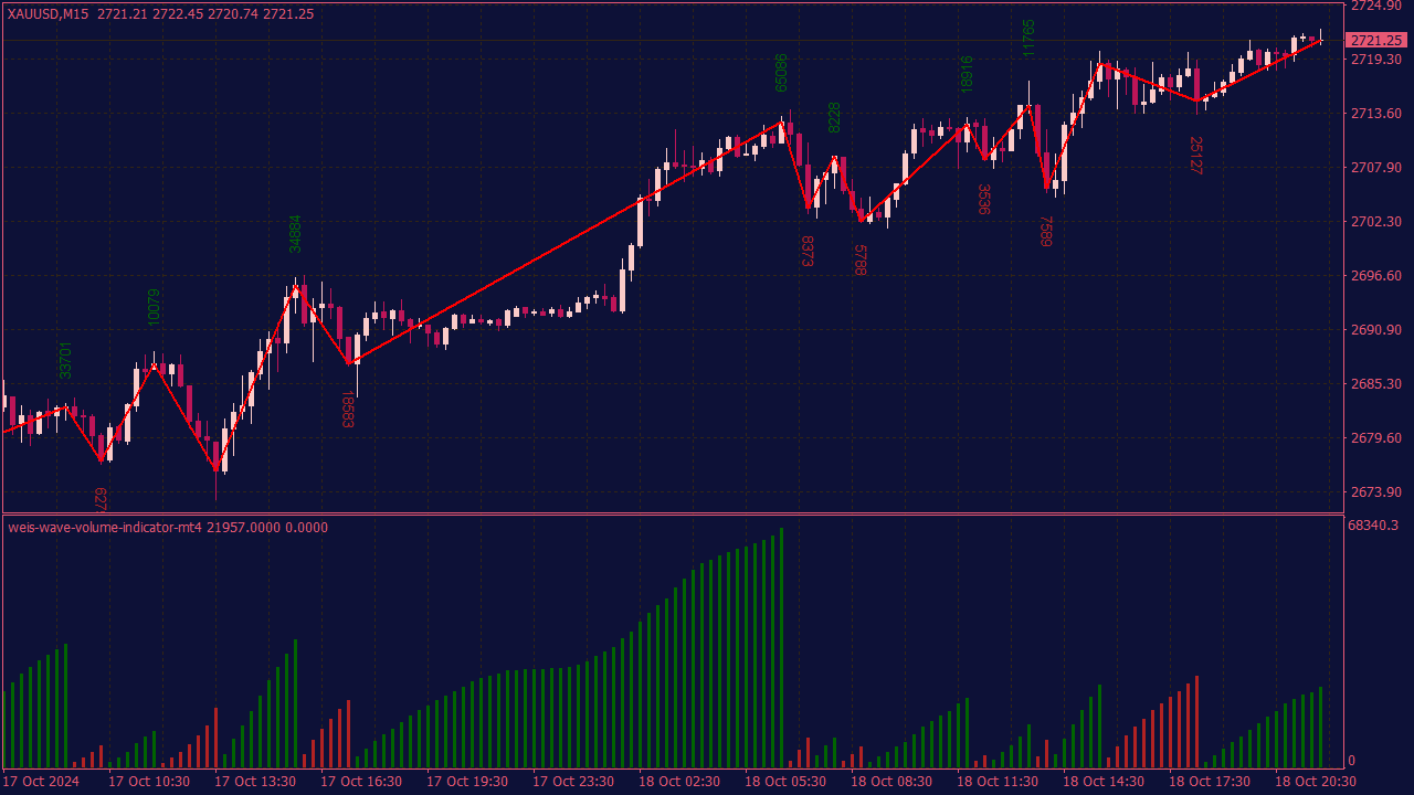
The Weis Wave Volume Indicator is a tool used to analyze price movements and trading volume in order to identify market trends and potential entry/exit points. To trade using this indicator, first familiarize yourself with how it differentiates between buying and selling pressure through wave formations. Look for bullish waves that indicate strong buying activity, suggesting a potential buy opportunity, while bearish waves may signal selling pressure, indicating a potential sell opportunity. Additionally, confirm your trades with other indicators or price action strategies, and always use proper risk management techniques to safeguard your capital.
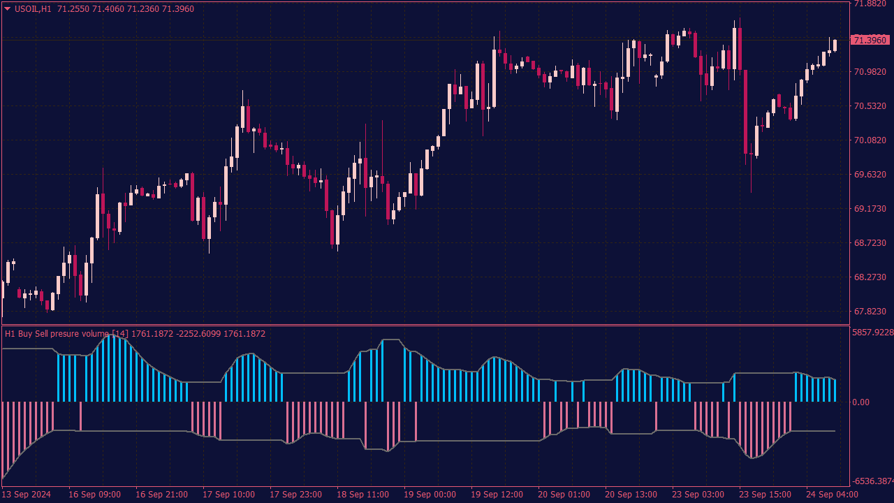
The Buy Sell Volume MTF Indicator is a trading tool designed to provide multi-timeframe analysis of market volume, helping traders identify potential buy and sell signals based on volume changes across different timeframes. This indicator typically generates alerts when specific volume thresholds are met or when buying/selling pressure shifts significantly, enabling traders to make informed decisions. It can enhance trading strategies by combining volume analysis with price movements, ensuring users can act quickly on high-probability trading opportunities.
Eight overlooked setups that become useful when price and participation stop telling the same story.
Most traders are introduced to volume through a handful of familiar rules: rising price and rising volume are bullish, weak volume makes a breakout suspicious, and divergence can warn that a trend is losing momentum.
Those ideas are not useless. They are simply incomplete.
Markets rarely behave as neatly as textbook examples suggest. A high-volume candle can mark genuine continuation, but it can also reveal absorption, liquidation, or exhaustion. A quiet pullback may indicate weak opposition, or it may reflect nothing more than a temporary lack of liquidity.
Forex adds another complication. The spot market is decentralized, so the volume displayed on many retail platforms is not a complete record of every transaction taking place worldwide. The broader FX market is largely organized as an over-the-counter market rather than through a single centralized exchange.
On many retail platforms, traders are looking at tick volume: the number of price changes recorded during a given period. MetaTrader 5, for example, defines Forex volume in terms of the number of price changes within the selected period.
That does not make the data worthless. Tick activity can still reveal changes in participation, urgency, and market attention. It simply needs to be interpreted for what it is.
The more useful question is rarely: Is volume high?
The better question is: What did price manage to achieve with that volume?
🔍 1. Heavy Volume, Almost No Progress
Imagine EUR/USD approaching a resistance area that has already rejected price several times. Activity suddenly increases, but the market gains only a few additional pips. The candle leaves an upper wick and closes well below its high.
That contradiction deserves attention.
A considerable amount of activity has entered the market, yet buyers have achieved very little. One possible explanation is absorption: incoming demand is being met by enough selling interest to prevent price from advancing freely.
The reverse can happen near support. Sellers become aggressive, volume expands, but price refuses to remain below the level.
This is often described as an effort-versus-result relationship. Volume represents the effort, while price movement represents the result. When effort rises sharply while the result deteriorates, the obvious side of the market may be meeting stronger opposition than the candle initially suggests.
The mistake is entering immediately because a single bar looks dramatic. High volume tells us that an important contest may be taking place. It does not tell us who has won.
A more defensible bearish sequence would be:
Price tests or briefly breaks resistance on unusually high activity.
The market fails to hold near the high.
A lower high forms beneath the rejection area.
Short-term support breaks with improving downside momentum.
For a bullish version, reverse the logic. A failed breakdown, a recovery above support, and a subsequent break of local resistance provide more information than the volume spike alone.
The absorption idea is invalid once price establishes clear acceptance beyond the defended area and begins moving efficiently in the original direction.
📉 2. The Breakout That Nobody Supports
Some breakouts look excellent in a screenshot.
Price clears a visible resistance level, momentum accelerates, and late buyers enter. Yet participation remains ordinary. Related currency pairs barely respond, and the next candle cannot extend the move.
A few minutes later, price is back inside the previous range.
This is where breakout analysis often becomes too simplistic. Traders focus on the moment price crosses a line, when the more important information comes afterward.
A genuine breakout should normally show some form of acceptance. Price does not need to move vertically, but it should demonstrate that participants are willing to conduct business beyond the former boundary.
Warning signs include:
The breakout candle closes only marginally beyond the level.
Activity remains normal for that session and time of day.
The next candle returns quickly to the old range.
A retest of the breakout level fails almost immediately.
Related currency pairs do not support the broader currency thesis.
The trade is not simply “sell because the breakout failed.” A stronger setup develops when price returns inside the range, fails to reclaim the level, and then breaks local structure in the opposite direction.
At that point, the market may contain trapped participants. Traders who bought the breakout now have to reconsider their positions, and their exits can add pressure to the reversal.
The failed breakout is therefore less about predicting a turning point and more about observing a loss of acceptance.
📈 3. The Pullback That Has No Conviction
One of the cleaner volume patterns appears after a strong directional move.
Suppose GBP/USD breaks above resistance with a wide candle, an assertive close, and activity clearly above its recent session average. Price then starts to retrace.
On price alone, the pullback may look uncomfortable. Volume can reveal whether the move against the trend carries any real urgency.
A constructive pullback often has a quieter character. Candle ranges contract, price overlaps, and activity declines. Sellers are moving the market lower, but they are not doing so efficiently.
That does not guarantee another leg higher. It does suggest that the correction may be driven by profit-taking rather than forceful new selling.
The most useful sequence is:
The initial impulse breaks a meaningful level with expanding activity.
The retracement develops on lower average volume.
Price remains above the former breakout area or another logical support zone.
A higher low or bullish rejection forms.
Activity increases again as price leaves the pullback structure.
The setup becomes less attractive when the correction is faster, deeper, and more active than the original breakout. At that point, the market may no longer be experiencing a passive retracement. The opposing side could be taking control.
This relationship between the impulse and the pullback is often more useful than the absolute size of the breakout candle.
🌍 4. The London Open False Start
The London open produces some of the most active trading conditions of the day. It also produces some of the most convincing false signals.
A common example begins with the Asian-session range. Price spends several hours trading between a relatively clear high and low. When European participation enters, the market breaks one side of that range.
Volume rises sharply. Stops are triggered. Breakout traders enter.
Then price turns and closes back inside the range.
The volume increase may look exceptional when compared with the preceding Asian candles, but that comparison is misleading. Higher activity around the London open is normal. The relevant question is whether the current move is unusual compared with previous London openings.
The quality of the setup improves when the session breakout also reaches a meaningful higher-timeframe location, such as:
A previous daily high or low
A weekly resistance or support area
The edge of a broader consolidation
A level created by an earlier economic announcement
A bearish version may begin with a break above the Asian high, followed by a long upper wick and a close back inside the range. Rather than shorting the first rejection, a patient trader can wait for a failed retest of the range high and a break of short-term support.
The bullish version works in reverse below the Asian low.
Not every Asian-range break is a liquidity trap. Some develop into powerful session trends. The setup becomes interesting only when the market demonstrates that the attempted breakout has failed.
📍 5. When a Low-Volume Area Refuses Price
Volume Profile traders often expect price to move quickly through low-volume areas. Sometimes it does. At other times, the market enters the zone, attracts a sudden increase in activity, and is rejected.
That failure can be more informative than the profile level itself.
Consider a market breaking below the boundary of a previous distribution. Activity increases during the move, but price cannot remain below the area. It closes back inside the earlier range and later holds the boundary during a retest.
The attempted auction lower has failed.
Instead of finding acceptance at cheaper prices, the market has rejected them. Price may then rotate toward an area where more trading previously occurred.
The same logic applies above a distribution. Price tests a low-volume area, briefly trades beyond it, and then returns to the previous value region.
The important distinction is between visiting a new area and establishing acceptance there.
A practical bullish setup might involve:
A temporary move below a low-volume boundary
Expanding activity during the breakdown attempt
A close back above the boundary
A successful retest from above
Improving momentum toward the previous high-volume region
These profile levels should be treated as zones rather than precise prices. The result can also change depending on the selected lookback range and the quality of the underlying volume feed.
📰 6. The Second Move After the News
The first reaction to a major economic release receives most of the attention. It is also often the most difficult part of the move to trade.
Spreads widen, price jumps between levels, and orders can be filled far from the expected price. The initial impulse may reverse before traders have had time to understand what the data mean.
A more patient approach is to study the market after the first shock has passed.
Suppose a central-bank announcement sends a currency higher. Price then retraces, but it remains above the pre-announcement range. Activity starts to settle, and a compact consolidation develops.
If the market later breaks that consolidation in the direction of the original repricing, the second move may provide cleaner information than the first.
By then, several things have changed:
The initial panic has started to fade.
The market has had time to interpret the announcement.
Price has shown whether the new area is being accepted.
Execution conditions may have begun to normalize.
The setup becomes especially interesting when the pullback occurs on declining activity and price remains outside the pre-news structure.
It should be avoided when the first move is fully retraced, price returns to the old range, or further headlines remain likely. During a central-bank press conference, for example, the market can change direction several times as comments are interpreted in real time.
Volume confirms that the event attracted attention. It does not guarantee that the first directional move was the correct one.
⚖️ 7. When Spot and Futures Tell Different Stories
Most retail forex traders analyze one chart from one broker. That is convenient, but it can create a false sense of certainty.
For major currencies, exchange-traded futures can provide an additional view of participation. CME Group's FX futures, for example, trade in a centralized liquidity pool and have published volume and open-interest data.
Futures do not represent the entire global FX market, and their pricing is not identical to spot. Even so, they can help answer a useful question:
Is the apparent increase in participation visible somewhere else?
Suppose EUR/USD breaks a major resistance level on the spot chart. Tick activity rises, but the corresponding euro futures contract shows little relative expansion and fails to break its equivalent structure convincingly.
That does not prove the spot move is false. It means one potentially useful layer of confirmation is missing.
Before treating the disagreement as meaningful, however, the trader needs to verify which futures contract is active. Futures contracts expire, and market participants can roll exposure from an expiring contract into a later contract.
A trader watching the expiring contract may conclude that participation in that contract is disappearing when activity has simply shifted to another expiration.
The strongest warning usually comes from a combination of factors:
The spot breakout fails to hold.
The active futures contract shows weak participation.
Related currency pairs do not confirm the move.
The breakout occurs during a thin or transitional period.
Cross-market confirmation is not about finding a perfect duplicate of the spot chart. It is about checking whether the move is broad, consistent, and supported beyond one platform.
⏱️ 8. The Volume Spike That Matters One Candle Later
Traders naturally focus on the largest volume bar on the chart. Often, the candle that follows provides more useful information.
A high-volume breakout followed by another strong close suggests acceptance. The same breakout followed by an immediate reversal suggests rejection. A spike followed by several narrow, overlapping candles may indicate balance or absorption.
The volume bar records activity. The market's response begins to reveal the outcome.
This is especially useful after:
A breakout from an established range
A test of a daily or weekly extreme
A sudden move during a quiet session
An economic announcement
A failed attempt to leave a profile zone
There is no need to decide what a volume spike means while the candle is still forming. Waiting for the next reaction removes some trades, but it also filters out many entries based on activity that never produced lasting control.
A trader who waits for evidence may enter later. That does not necessarily mean entering worse.
🧭 Three Rules That Matter More Than the Indicator
📌 Location Comes First
High activity in the middle of an ordinary range may provide very little information. The same reading becomes more relevant near a weekly high, a failed breakout, a session extreme, or a level created by a major economic event.
Volume becomes meaningful when the trader can explain why that particular price matters.
🔄 Activity and Direction Are Not the Same Thing
A green candle with high volume does not mean that every important participant was buying. It means price closed higher during a period of elevated activity.
There may also have been substantial selling. The candle's close, its wick, the following price action, and the market's ability to continue reveal how effective the buyers really were.
🧩 More Indicators Do Not Always Mean More Evidence
OBV, VWAP, relative volume, and Volume Profile may all be calculated from the same broker's tick-volume feed.
When they agree, the chart can look impressively convincing. In reality, the trader may simply be viewing the same underlying information through several calculations.
More independent confirmation can come from:
Higher-timeframe market structure
A second spot data feed
Currency-futures participation
Related currency pairs
Macroeconomic context
Price acceptance after the initial signal
Different indicators are not necessarily different opinions.
🎯 The Closest Thing to a Professional Edge
There is no hidden volume indicator that reliably reveals where EUR/USD will trade tomorrow.
What experienced traders often do differently is less dramatic and more useful.
They compare activity with the correct trading session. They notice when a move requires enormous effort but produces very little progress. They wait to see whether a breakout is accepted. They check whether an apparent futures divergence is simply the result of contract rollover. They also recognize when several indicators are repeating the same underlying information.
Most importantly, they use volume to reject weak trades, not only to justify new ones.
A breakout without participation can be ignored. A reversal without confirmation can be left alone. A news move with poor execution conditions does not have to be traded.
That is the practical value of volume analysis.
It does not remove uncertainty. It helps reveal when the market's behavior is inconsistent with the obvious explanation.
Those inconsistencies are often where the most interesting opportunities begin.
Volume shows how intense the negotiation has become. Price shows which side is actually moving the market.
📝 Editor’s Note
The strategies and market concepts discussed in our content are designed to help readers better understand market behavior. They are not trading recommendations. Financial markets are volatile, and every trader should test ideas carefully, manage risk and make independent decisions.